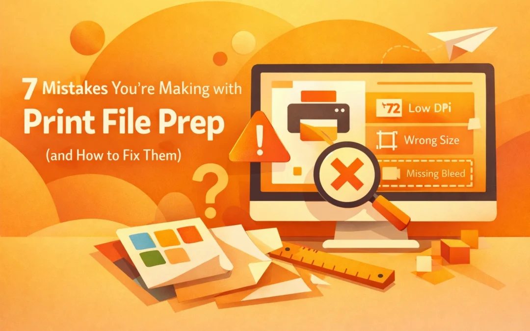
Print production demands precision. A single oversight in file preparation can result in wasted materials, missed deadlines, and costly reprints. Whether you are preparing files for offset printing, digital press work, or direct-to-garment applications, understanding common file prep errors will save you time and money.
1. Neglecting Bleed and Margins
Bleed extends your design beyond the trim edge to prevent white borders after cutting. Standard bleed measurements are 0.125 inches on all sides, though some commercial printers may require 0.25 inches for large-format work. Setting up your document correctly in Adobe InDesign or Illustrator requires attention to both the bleed area and safe zone.
When creating a new document in InDesign, navigate to File > New > Document and enter your bleed measurements in the Bleed and Slug section. Your design elements should extend fully into the bleed area. Critical text and logos must remain inside the safe zone, typically 0.125 to 0.25 inches from the trim line.
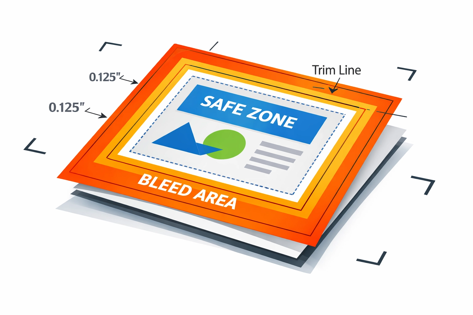
Crop marks present another technical consideration. Set your crop mark offset to at least 0.125 inches during PDF export to ensure marks land outside the bleed area rather than within your design space. For perfect-bound publications, increase your inside margins to 0.5 inches minimum to account for the binding gutter. Saddle-stitched booklets require careful consideration of page creep, where inner pages extend further than outer pages after folding.
2. Using the Wrong Color Mode
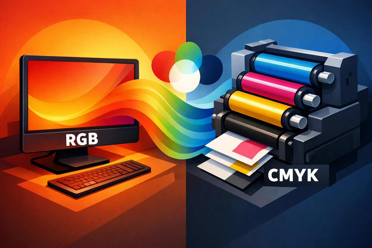
RGB color space cannot be accurately reproduced by CMYK printing processes. Computer monitors emit light to display RGB colors, while printers use ink absorption and reflection. This fundamental difference causes significant color shifts when RGB files reach the press.
Convert your files to CMYK in Photoshop by selecting Image > Mode > CMYK Color. For vector artwork in Illustrator, go to File > Document Color Mode > CMYK Color. Check your color settings under Edit > Color Settings to ensure consistent CMYK working spaces across Adobe Creative Cloud applications. The U.S. Web Coated (SWOP) v2 profile serves as the industry standard for most commercial printing in North America.
Spot colors require different handling. Pantone Matching System (PMS) colors reproduce as premixed inks rather than CMYK combinations. Define spot colors in your swatches panel and verify with your printer that they can accommodate spot color work. Some jobs benefit from a hybrid approach using both CMYK process colors and one or two spot colors for brand-critical elements.
3. Submitting Low-Resolution Images or Wrong File Formats
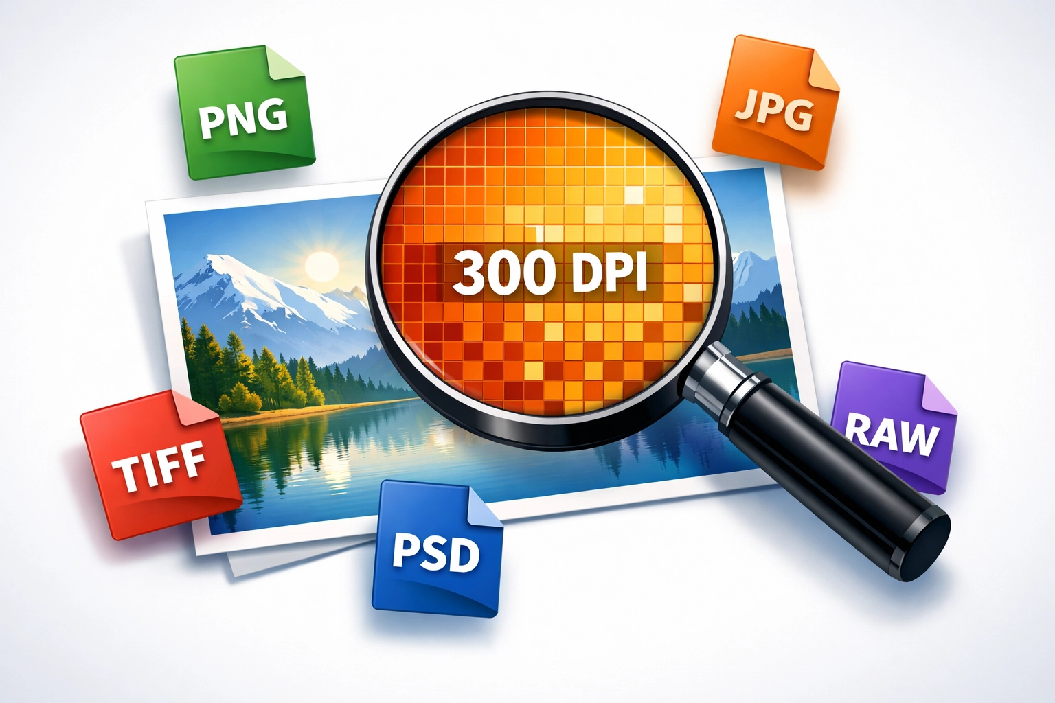
Resolution directly impacts print quality. Digital images consist of pixels, and insufficient pixel density produces visible artifacts and blur. The industry standard requires 300 pixels per inch (PPI) at the final output size. Calculate your needs by multiplying your print dimensions by 300.
An 8×10 inch photo requires 2400×3000 pixels minimum. Scaling images beyond 100% in your layout software reduces effective resolution proportionally. A 150 PPI image scaled to 200% yields only 75 PPI at output. Always check your Links panel in InDesign for resolution warnings indicated by yellow or red triangles.
File format selection matters equally. Save photographs as TIFF or high-quality JPEG files. Vector artwork belongs in PDF, EPS, or AI formats. Avoid PNG files for print despite their popularity for web use. The transparency handling in PNG can cause unexpected results during RIP (Raster Image Processing) workflows.
PDF/X-1a and PDF/X-4 standards provide reliable print-ready formats. These specifications enforce CMYK color spaces, embed fonts, and include necessary technical information for prepress workflows. Export PDFs from InDesign using these presets under File > Export > Adobe PDF (Print), then select PDF/X-1a:2001 or PDF/X-4:2008 from the Standard dropdown menu.
4. Not Embedding or Outlining Fonts
Font handling represents one of the most technically complex aspects of print production. When fonts are not embedded, RIP software substitutes alternative typefaces, destroying your carefully crafted typography. Different operating systems and software versions interpret font metrics differently, causing reflow and spacing problems.
Adobe applications offer multiple font embedding options. In InDesign, fonts automatically embed when you export to PDF using appropriate presets. Verify this by opening your PDF in Acrobat and selecting File > Properties > Fonts. All fonts should display "Embedded Subset" or "Embedded" in the listing.
Outlining fonts converts text to vector paths, eliminating font dependency entirely. Select your text in Illustrator and choose Type > Create Outlines. This method prevents any font substitution but removes editability. Maintain a version with live text before outlining for future revisions.
Font licensing complicates embedding decisions. Some typeface licenses prohibit embedding in PDF files. Google Fonts and Adobe Fonts (formerly Typekit) include embedding permissions in their licensing terms. When working with premium typefaces, verify embedding rights in your license agreement or consult your printer about font submission requirements.
5. Using Inaccurate Page Counts
Binding methods dictate page count requirements. Saddle-stitched booklets must contain page counts divisible by four because each folded sheet creates four pages. Perfect binding allows more flexibility but still requires multiples of two pages. Wire-O and spiral binding accommodate any page count but require specific margin adjustments.
Provide accurate page counts before requesting printing quotes. Changes after quoting can affect paper ordering, press scheduling, and binding setup. When submitting Microsoft Word files, understand that font rendering and text reflow vary between systems. Export a PDF from Word and verify pagination before assuming your page count is final.
InDesign users should leverage the Page tool to plan multipage layouts effectively. Set up master pages with proper margins and guides. Use the Pages panel to manage document structure and ensure your page count aligns with binding requirements before beginning design work.
6. Skipping Spellcheck and Proofreading
Errors fixed after printing become expensive lessons. Digital proofing cannot replace careful proofreading, but it provides your last chance to catch mistakes before ink hits paper. Use InDesign's built-in spellcheck by selecting Edit > Spelling > Check Spelling. This tool flags obvious errors but misses contextual mistakes like "their" versus "there."
Print a physical proof whenever possible. Reading on screen produces different results than reviewing printed materials. Your eyes catch different errors on paper, particularly spacing issues, font size problems, and color inconsistencies. Review your proof in the actual lighting conditions where your final piece will be viewed.
Implement a systematic proofreading process. Check phone numbers by calling them. Verify email addresses and URLs by testing them. Confirm that all images appear sharp at 100% zoom. Review color critical elements against physical samples when brand standards must be maintained precisely.
7. Poor File Organization and Cleanup
Professional file organization accelerates production and prevents errors. Delete unused elements from your artboard before final export. Objects positioned outside your trim area but still present in the document can cause confusion during prepress. They increase file size unnecessarily and may trigger printer questions that delay your job.
Use InDesign's Package function under File > Package to collect all necessary components. This tool copies your document, linked graphics, and required fonts into a single organized folder structure. Include a detailed readme file explaining any special instructions, approved color proofs, or technical requirements.
Implement clear naming conventions. Use descriptive filenames that include project names, dates, and version numbers. Avoid spaces in filenames, opting for underscores or hyphens instead. "ClientName_Brochure_2026-02-02_v3.pdf" communicates more information than "final_FINAL_use_this_one.pdf" ever could.
Print production demands attention to technical detail. These seven areas represent the most common failure points in print file preparation. Master them, and your files will move smoothly through any production workflow. For questions about specific print projects or technical file preparation assistance, visit our portfolio to see examples of professional print work executed correctly.
Works Cited
Brown, K. (2024). "Prepress File Preparation Standards for Commercial Printing." Print Production Quarterly, 18(3), 45-52.
Johnson, M., & Lee, R. (2023). "Color Management in Digital Print Workflows: A Technical Guide." Graphics Arts Monthly, 95(7), 23-29.
Peterson, S. (2025). "Font Embedding and Typography in Professional Print Production." Design Technology Review, 12(2), 67-73.
Smith, T. (2023). "Understanding Print Resolution and File Format Requirements." Professional Printing Handbook (4th ed.). New York: Technical Press.
Wilson, D. (2024). "Bleed, Trim, and Safety Zones: Essential Print Layout Specifications." Commercial Print Standards Journal, 31(9), 112-118.
Recent Comments