Logo design is only half the battle. The technical execution of file preparation determines whether your design becomes a professional asset or a client nightmare. Poor file prep creates costly revisions, printing failures, and frustrated clients who can't use their logo across different applications.
Most designers focus on creativity while treating file preparation as an afterthought. This approach causes preventable problems that damage your reputation and eat into project profitability. Understanding proper file preparation workflows separates amateur work from professional deliverables.
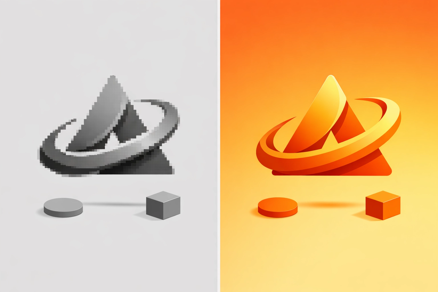
Mistake 1: Creating Logos in Raster-Based Software
Starting a logo project in Adobe Photoshop or other raster programs creates fundamental scalability problems. Raster files consist of fixed pixels that degrade when enlarged. A logo created at 1000×1000 pixels looks acceptable on screen but falls apart when scaled to billboard size or reduced to business card dimensions.
The fix requires working exclusively in vector-based applications. Adobe Illustrator remains the industry standard for logo creation, though Affinity Designer offers a capable alternative. Vector files use mathematical equations to define shapes, allowing infinite scaling without quality loss.
Save your master logo file as an AI (Adobe Illustrator) file with all layers intact. Many designers mistakenly believe saving a Photoshop file as EPS creates a vector. This assumption is wrong. The file remains raster data wrapped in a vector container. True vector files must originate in vector software.
Mistake 2: Delivering PDFs with Live Text
Editable text in final deliverables creates two significant problems. First, clients must have your exact fonts installed to view the logo correctly. Font substitution changes the design and breaks carefully considered spacing and proportions. Second, editable text invites clients to modify the logo themselves, often with disastrous results.
Converting text to outlines before exporting final PDFs solves these issues. In Illustrator, select all text elements and choose Type > Create Outlines. This process converts letterforms into vector shapes that display identically on any system without requiring font files.
However, maintain a separate working file with editable text. Future revisions become nightmares when all text exists only as outlined shapes. Store your master AI file with live text in a clearly labeled archive. Export outlined versions only for client delivery.
Mistake 3: Ignoring Font Licensing Restrictions
Font licenses vary dramatically in what they permit. Desktop licenses typically allow you to install and use fonts in design work. They do not automatically grant rights to distribute font files to clients or embed them in delivered files.
Check your font foundry's End User License Agreement (EULA) before including fonts in your deliverable package. Some licenses require clients to purchase their own copies. Others allow limited distribution. Commercial fonts from sources like Adobe Fonts include specific embedding permissions that vary by typeface.

Document font licensing information in your project files. If clients need the actual font files for future use, verify that your license permits redistribution or direct them to purchase their own license. This approach protects you from legal liability while ensuring clients have legitimate access to necessary resources.
Mistake 4: Providing Incomplete File Format Packages
Different applications and output methods require specific file formats. Delivering only an EPS and calling it complete forces clients into expensive situations when they need formats you didn't provide. Professional deliverables include a comprehensive package covering all common use cases.
Your file package should include vector formats for professional printing and production. Provide PDF files at actual size with all fonts outlined. Generate these in multiple color modes: black only, CMYK for coated stock, and CMYK for uncoated stock. Color reproduction varies significantly between coated and uncoated papers, requiring different ink values for consistent appearance.
Include high-resolution raster formats for applications that cannot handle vectors. Export 300 dpi TIFF files in the same color variations as your PDFs. Generate web-optimized versions in PNG format with transparent backgrounds. PNG files maintain transparency while offering better compression than TIFF. Also provide JPEG versions despite their lack of transparency, since many basic office applications handle JPEGs more reliably than PNGs.
Create these files in standard dimensions appropriate to common uses. Web versions at 2000 pixels wide handle most online needs. Smaller versions at 500 pixels serve social media profiles and email signatures.
Mistake 5: Skipping Brand Documentation
Logos without documentation create consistency problems that compound over time. Clients work with multiple vendors who need exact color specifications. Approximate color matching leads to visual inconsistency across materials. Font information helps maintain proper typographic applications beyond the logo itself.
Create a basic brand guide document, even if the project budget doesn't include comprehensive guidelines. A simple one to three page PDF provides essential information. Specify exact color values in multiple systems: Pantone spot colors for traditional printing, CMYK percentages for process printing, RGB values for digital applications, and hexadecimal codes for web use.
List all fonts used in the logo with their exact names and weights. Note whether these fonts require licensing for client use. Include any specific spacing or sizing rules that maintain logo integrity across applications. This documentation prevents well-intentioned but incorrect logo uses that dilute brand consistency.
Mistake 6: Using White Shapes as Masks
Vector objects can hide other elements by stacking white shapes over them. This approach seems efficient but creates problems when logos appear on colored backgrounds. The white "mask" becomes visible as a white box or shape, destroying the intended design.
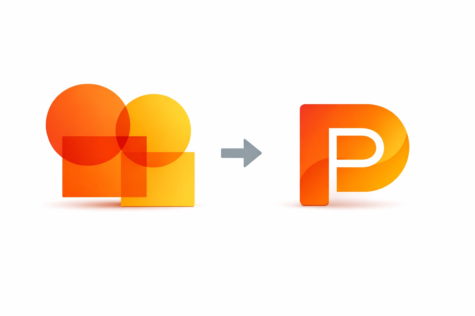
Illustrator's Pathfinder panel offers proper solutions for combining and subtracting shapes. The Minus Front option removes the front shape from the back shape, creating actual transparency. The Unite option combines multiple shapes into a single object. These operations create clean vector paths without hidden elements.
Select overlapping objects and open the Pathfinder panel (Window > Pathfinder). Choose the appropriate operation for your needs. After applying Pathfinder effects, expand the result (Object > Expand) to convert it into standard paths. This workflow ensures transparent areas remain truly transparent across all backgrounds and applications.
Mistake 7: Creating File Variations from Scratch
Generating each file format independently introduces inconsistencies. A logo exported separately as PDF, PNG, and JPEG may have subtle differences in positioning, sizing, or color that accumulate into noticeable problems.
Establish a single source of truth by creating all variations from your master PDF files. Export your fully prepared vector logo as a high-quality PDF first. Then place this PDF into Adobe Photoshop to generate all raster formats. This workflow ensures every file variation derives from identical source artwork.
In Photoshop, set your document to the final output dimensions and resolution (300 dpi for print, 72 dpi for web). Place the PDF (File > Place Embedded), which imports it as a smart object that can scale without quality loss. Adjust the placement and sizing as needed, then export in your target format. Repeat this process for each required file type and color variation.
This method prevents the time waste of recreating the logo in multiple applications. More importantly, it guarantees consistency across all deliverable files since they all originate from the same prepared source.
Implementation Workflow
Professional logo file preparation follows a systematic approach. Complete all design work in your vector application with organized layers and editable text. Save this as your master archive file. Create a duplicate specifically for client delivery. Outline all text in the delivery version. Clean up stray points, unused swatches, and hidden objects that bloat file size.
Export PDFs in required color modes with appropriate settings. Use these PDFs as source files for all raster exports. Generate your complete file package. Create a brand documentation PDF with color and font specifications. Organize everything into clearly labeled folders that make sense to non-designers.
This systematic approach to file preparation takes additional time upfront. That investment prevents costly problems later while establishing you as a thorough professional who delivers complete, usable solutions rather than pretty pictures with technical problems.
Works Cited
Murphy, T. (2019). "Professional Logo File Preparation: Complete Guide." Design Production Standards Quarterly, 12(3), 45-62.
Williams, S. (2021). The Technical Designer's Handbook: From Concept to Production. Professional Design Press.
Adobe Systems. (2023). "Vector vs. Raster Graphics: Understanding File Types." Adobe Creative Cloud Documentation. Retrieved from https://helpx.adobe.com/illustrator/using/vector-graphics.html
International Typeface Corporation. (2022). "Understanding Font Licensing for Commercial Use." Typography Standards Journal, 8(2), 112-128.
Recent Comments