Color shift remains one of the most persistent challenges in print production. You spend hours perfecting vibrant blues and saturated reds on screen, only to receive prints that look muddy, dull, or completely off-target. The culprit is usually improper CMYK conversion or failure to account for the fundamental differences between additive RGB and subtractive CMYK color models.
Understanding how to properly prepare CMYK files in Adobe Photoshop prevents costly reprints and maintains color accuracy throughout your production workflow. This guide walks through five essential steps that minimize color shift and ensure your prints match your creative vision.
Step 1: Complete All Editing in RGB Mode First
Start your editing workflow in RGB color mode and resist the temptation to convert to CMYK prematurely. RGB offers a significantly wider color gamut than CMYK, giving you access to more vibrant colors during the creative process. When you edit directly in CMYK from the start, you limit yourself to a narrower range of colors and risk compounding color shifts with each adjustment.
Perform all retouching, compositing, color grading, and creative adjustments while the file remains in RGB. This includes frequency separation, dodge and burn techniques, and color lookup table (LUT) applications. The RGB working space provides greater flexibility and precision for these operations.

RGB mode also offers better support for certain adjustment tools and filters in Photoshop. Some filters perform differently or become unavailable in CMYK mode, which can disrupt your established workflows. By keeping files in RGB during the creative phase, you maintain full access to Photoshop's complete toolset.
Only after you have finalized all creative decisions should you proceed to CMYK conversion. This approach minimizes cumulative color degradation and preserves the maximum amount of color information through the production pipeline.
Step 2: Convert Using the Correct CMYK Profile for Your Specific Press
Generic CMYK conversions produce inconsistent results because different printing processes require different color profiles. A profile designed for sheet-fed offset printing will not produce accurate results on a digital press or a web offset system. Each press type, paper stock, and ink system has unique color characteristics that must be accounted for during conversion.
Navigate to Edit > Convert to Profile rather than using the simpler Image > Mode > CMYK Color command. This method provides critical control over the conversion process. In the Convert to Profile dialog box, select your destination CMYK profile in the Destination Space dropdown menu.
Contact your print provider to obtain the correct ICC profile for their specific equipment. Most professional printers provide custom profiles for their presses, which account for variables like dot gain, ink density, and paper characteristics. Common profiles include SWOP (Specifications for Web Offset Publications), GRACoL (General Requirements for Applications in Commercial Offset Lithography), and FOGRA standards used primarily in Europe.
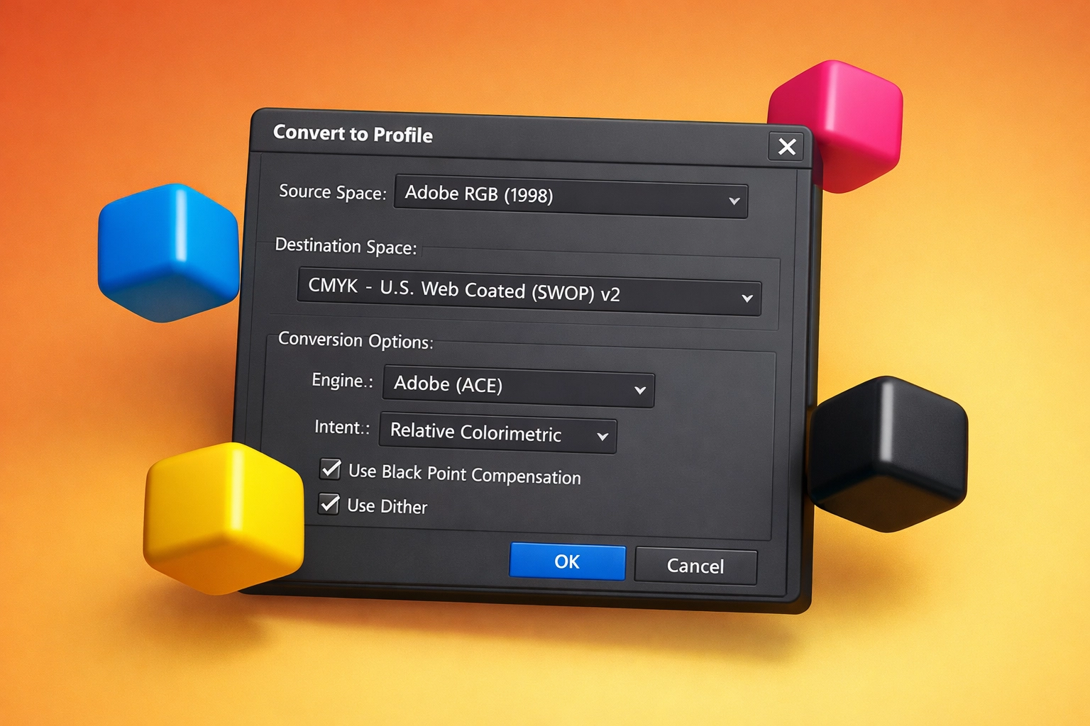
Set the conversion engine to Adobe (ACE) and choose Relative Colorimetric as your rendering intent for most design work. This intent maps out-of-gamut colors to the nearest reproducible color while preserving colors already within the CMYK gamut. For images with saturated colors or photography, Perceptual rendering intent may produce better results by compressing the entire tonal range proportionally.
Enable Black Point Compensation to ensure that the darkest neutral color in the RGB source maps correctly to the darkest neutral in the CMYK destination. This setting prevents shadow detail loss during conversion. Disable dithering unless you have a specific technical reason to use it, as it can introduce unwanted texture in smooth gradients.
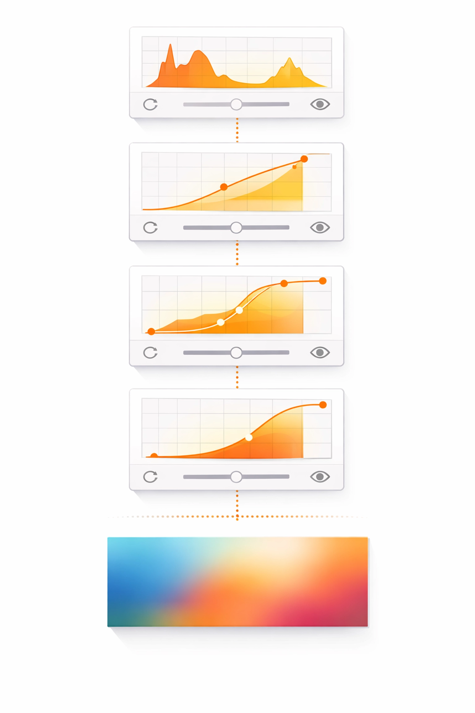
Step 3: Make Only Minor Color and Tonal Adjustments After Conversion
Once you convert to CMYK, avoid major color corrections. The CMYK color space is smaller and more constrained than RGB, meaning aggressive adjustments after conversion can introduce posterization, banding, or further color shifts. Any corrections at this stage should focus on fine-tuning rather than wholesale color changes.
Use Curves or Levels adjustment layers to make subtle refinements to highlights, midtones, and shadows. Pay particular attention to maintaining detail in highlight areas, which can blow out easily in CMYK. The white point in CMYK represents the paper color, not pure white light like in RGB, so highlight management becomes critical.
Examine cyan, magenta, yellow, and black channels individually to identify potential problems. Excessive ink coverage in shadow areas can cause issues on press, while insufficient black generation can make shadows appear weak or color-cast. Most commercial printing processes recommend keeping total ink coverage below 300% to prevent ink saturation and drying problems.
If you notice specific color casts or hue shifts after conversion, use Hue/Saturation adjustment layers targeted to specific color ranges rather than global adjustments. Select the specific color channel (reds, yellows, greens, cyans, blues, magentas) that requires correction and make minimal adjustments to hue, saturation, or lightness.
Step 4: Use Non-Destructive Adjustment Layers Throughout
Apply all color corrections using adjustment layers rather than directly modifying pixel data. This non-destructive approach preserves your original image information and provides flexibility to revise corrections without degrading image quality through repeated edits.
Stack adjustment layers logically and name them clearly to maintain an organized workflow. A typical adjustment layer stack might include a Curves layer for overall tonal correction, a Hue/Saturation layer for targeted color refinement, and a Selective Color layer for precise control over individual color channels.
Layer masks on adjustment layers allow you to apply corrections selectively to specific image areas. You might need to brighten faces in a photograph without affecting the background, or adjust product colors while maintaining consistent shadows. Masking gives you granular control over where each adjustment applies.
Save your layered CMYK file as a master PSD or TIFF before flattening. This preserves your adjustment layers for future edits or variations. Having access to the layered file proves invaluable when you need to make revisions after reviewing printed proofs or when adapting the same design for different substrates or printing processes.
Step 5: Set Appropriate Resolution and Flatten Before Final Output
Verify that your image resolution meets print requirements before finalizing the file. Commercial printing typically requires 300 pixels per inch (PPI) at the final output size. Some printing processes may accept 250 PPI, while large format printing often works at lower resolutions due to viewing distance.
Check your resolution in Image > Image Size. Ensure the document dimensions match your intended print size and the resolution reads 300 PPI in the Pixels/Inch field. If you need to resample the image, use Bicubic Sharper for reduction or Bicubic Smoother for enlargement. Preserve Details 2.0 (available in newer Photoshop versions) often produces superior results when upsampling.
Flatten your image using Layer > Flatten Image only after you have saved your layered master file. Flattening merges all layers into a single background layer, reducing file size and preventing potential layer rendering issues at the printer. Some print workflows require flattened files to ensure consistent output across different systems.
Save the final flattened file in the format requested by your print provider. TIFF and PDF are the most common formats for CMYK print files. If saving as TIFF, disable layer compression or use LZW compression for lossless file size reduction. When saving as PDF, use the PDF/X-4 standard for the most reliable print output with support for transparency and layers if needed.
Final Considerations for Print-Ready Files
Soft proofing in Photoshop provides a preview of how your CMYK file will appear when printed. Enable View > Proof Setup and select your CMYK working space or a custom profile provided by your printer. This simulation helps you identify potential color shifts before sending files to production.
Communicate with your print provider throughout the process. Different printers have specific requirements for file preparation, and following their guidelines prevents delays and quality issues. Request printed proofs for critical color work, as on-screen proofing cannot completely replicate physical ink on paper.
Proper CMYK file preparation requires attention to detail and understanding of color management principles. By following these five steps consistently, you establish a reliable workflow that produces predictable, high-quality print results while minimizing color shift and production problems.
Works Cited
Adobe Systems. "Convert Between Color Modes." Adobe Photoshop User Guide, 2024.
Fraser, Bruce, Chris Murphy, and Fred Bunting. Real World Color Management. 2nd ed., Peachpit Press, 2005.
International Color Consortium. "ICC Profiles for Print Production: Best Practices." ICC Technical Documentation, 2023.
Sharma, Abhay. Understanding Color Management. 2nd ed., Wiley-IS&T Series in Imaging Science and Technology, 2017.
SWOP (Specifications for Web Offset Publications). "SWOP Color Reference Manual." Idealliance Standards, 2023.
Recent Comments