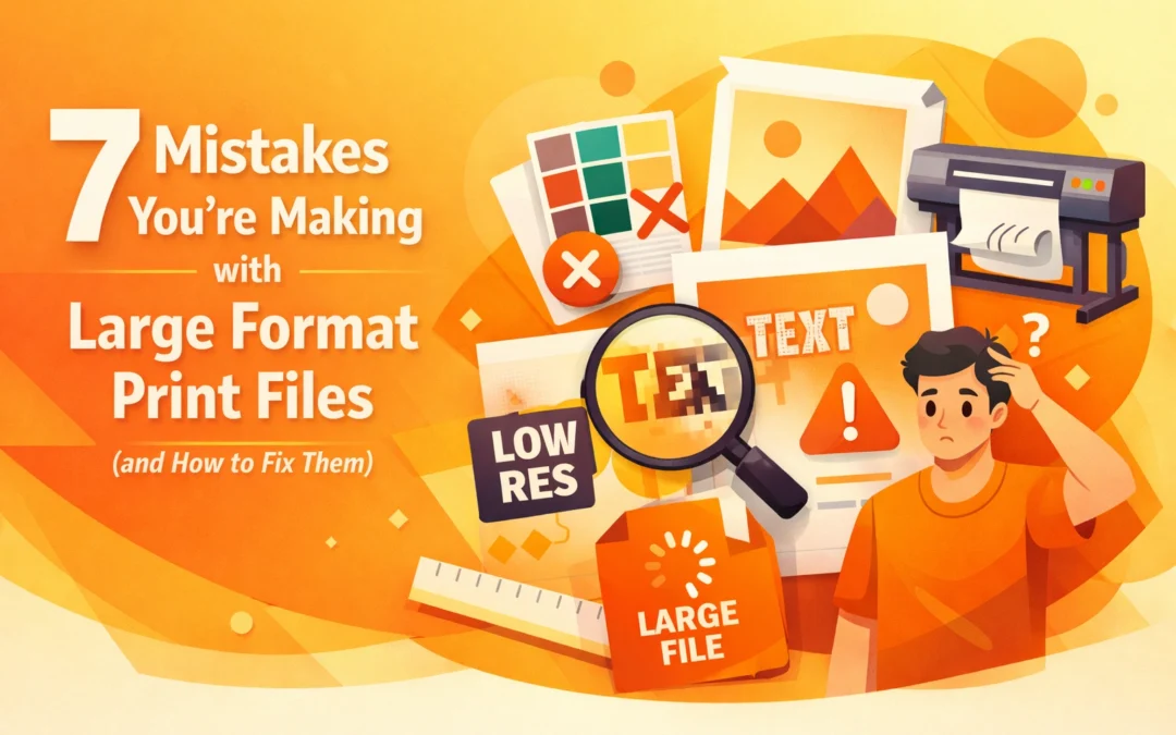
Large format printing represents a significant investment in both materials and production time. When a project involves printing a ten-foot banner or a full vehicle wrap, the margin for error disappears. Unlike small-scale digital printing, mistakes in large format files are magnified physically and financially. A single resolution error or a color space oversight can lead to hundreds of dollars in wasted substrate and ink. At Creative Design Hub (84G), we see these technical hurdles frequently. Mastering the workflow between design software like Adobe Creative Cloud and Raster Image Processor (RIP) software is essential for any professional designer.
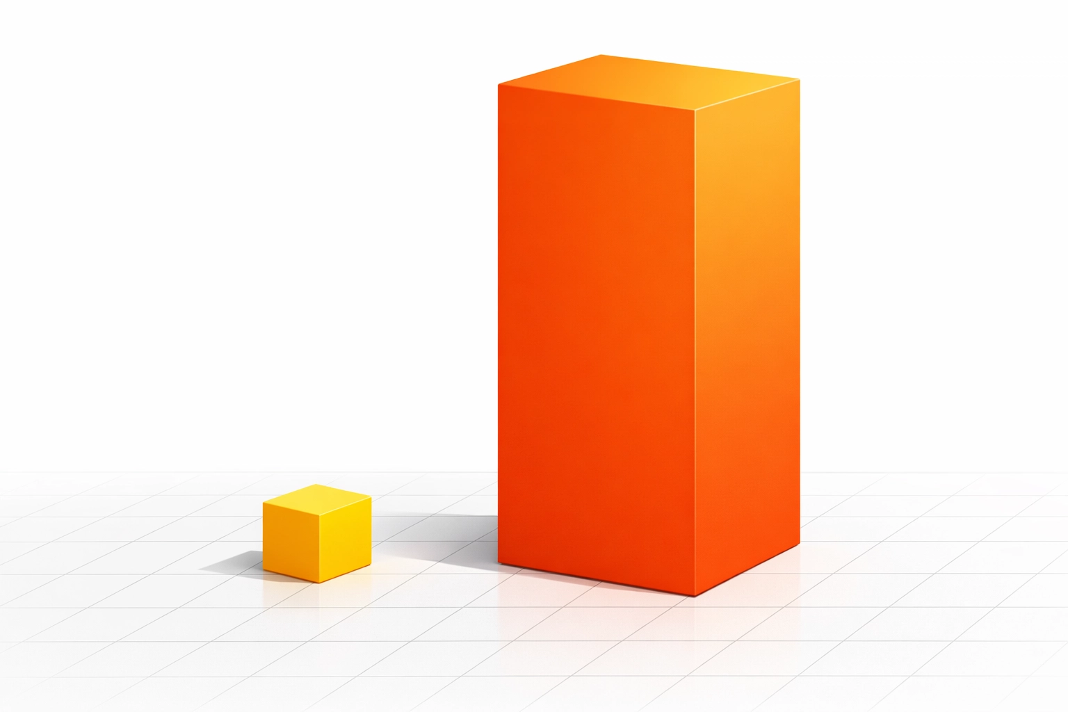
1. Incorrect Scaling and Artboard Dimensions
Many designers approach a large format project using the same mindset as a standard letter-sized flyer. However, software limitations often dictate a different strategy. For instance, Adobe Illustrator previously had a canvas limit that prevented designers from creating files at full scale for extremely large projects. While recent updates have expanded this, many legacy workflows and RIP softwares still struggle with massive dimensions.
The most common mistake is failing to communicate the scale to the print house. If you are designing a forty-foot billboard, you should work at a 1:10 scale. This means your artboard should be four feet wide. You must ensure that the resolution of any raster elements is high enough so that when the file is scaled up by 1000 percent at the printer, it maintains its integrity. Always label your file name with the scale used, such as "Project_Name_10_Scale.pdf," to prevent the prepress technician from printing the file at the literal artboard size.
2. Misunderstanding PPI Versus DPI Requirements
There is a pervasive myth that every print file must be 300 pixels per inch (PPI). While this is true for a brochure held at arm's length, it is often unnecessary for large format applications. The required resolution is dictated by the viewing distance. A banner hanging thirty feet in the air does not require the same pixel density as a business card.
For large format prints viewed from more than ten feet away, 100 to 150 PPI at full size is generally sufficient. If you provide a file at 300 PPI for a massive wall mural, the file size will become unwieldy, potentially crashing the RIP software or causing significant lag during the rendering process. Conversely, using a low-resolution web image for a trade show booth will result in visible pixelation. Always calculate your effective PPI based on the final output size rather than the initial document size. You can learn more about technical specifications on our FAQ page.
3. Designing in RGB Instead of CMYK
The digital displays we use to design operate in the RGB (Red, Green, Blue) color space. Professional printers utilize CMYK (Cyan, Magenta, Yellow, Black) or expanded gamut ink sets. When a designer submits an RGB file, the printer's software must convert those colors to CMYK. This often results in "dulling" the vibrant neon greens or deep blues that appeared bright on the monitor.
To avoid this, set your document color mode to CMYK from the start. This allows you to see a more accurate representation of the final product. If your project requires specific brand colors, use the Pantone Matching System (PMS). High-end RIP software can target these specific spot colors more accurately than a standard CMYK conversion. If you are unsure about color reproduction for your specific project, you can view our portfolio to see examples of our color accuracy.
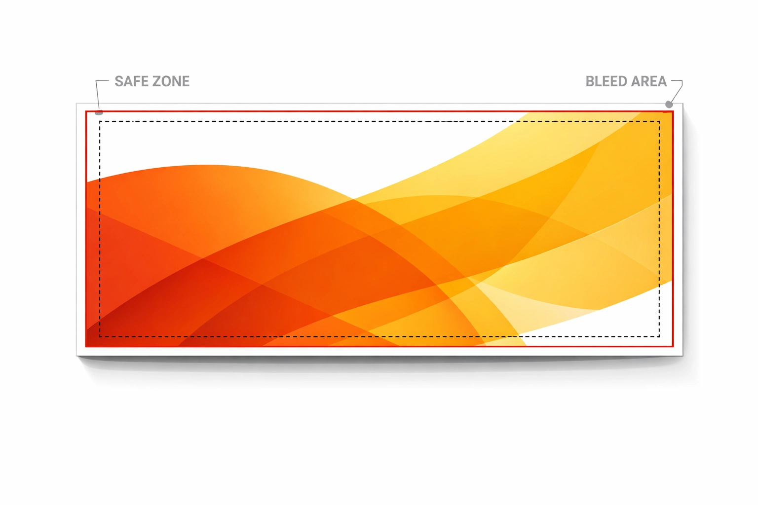
4. Neglecting Bleed and Finishing Margins
Bleed is the extra area of a design that extends beyond the trim line. In large format printing, bleed is critical because the cutting process is rarely 100 percent precise. If you do not include a bleed, you may end up with a thin white line along the edge of your finished product.
Standard small-scale print usually requires a 0.125-inch bleed. Large format requires more. For a standard banner, we recommend at least 0.25 to 0.5 inches of bleed. If the project involves pole pockets or hemmed edges, you might need two to four inches of "safe zone" to ensure that grommets or stitching do not punch through your text or logo. Always consult with your printer about the specific finishing requirements before you finalize your layout.
5. Failing to Outline Fonts and Embed Links
A common point of failure in the production pipeline is the "missing font" error. Even if you save your file as a PDF, fonts can sometimes fail to render correctly if they are not embedded or outlined. This is particularly problematic in large format where specialized or decorative fonts are common.
In Adobe Illustrator, you should select all text and use the "Create Outlines" command before sending the final file. This converts your text into vector shapes, ensuring that it looks exactly as intended regardless of whether the printer has the font installed. Additionally, ensure all placed images are "Embedded" rather than "Linked." If an image is linked and you do not send the source file, the printer will receive a low-resolution thumbnail or a blank box.
6. Overlooking Transparency and Layer Flattening
Modern design involves a heavy use of drop shadows, glows, and transparent overlays. While these look great on screen, they can cause "stitching" or "white box" artifacts when processed by older RIP software. This happens when the software tries to interpret complex overlapping vector and raster data.
The best way to fix this is to use the PDF/X-4 standard when exporting your work. This format is designed to handle transparencies reliably. If you are working in a workflow that requires an older format like PDF/X-1a, you must manually flatten your transparencies. Use the "Flattener Preview" in Acrobat or Illustrator to identify potential problem areas before the file leaves your desk. For more information on how we handle these technical processes, visit our info page.
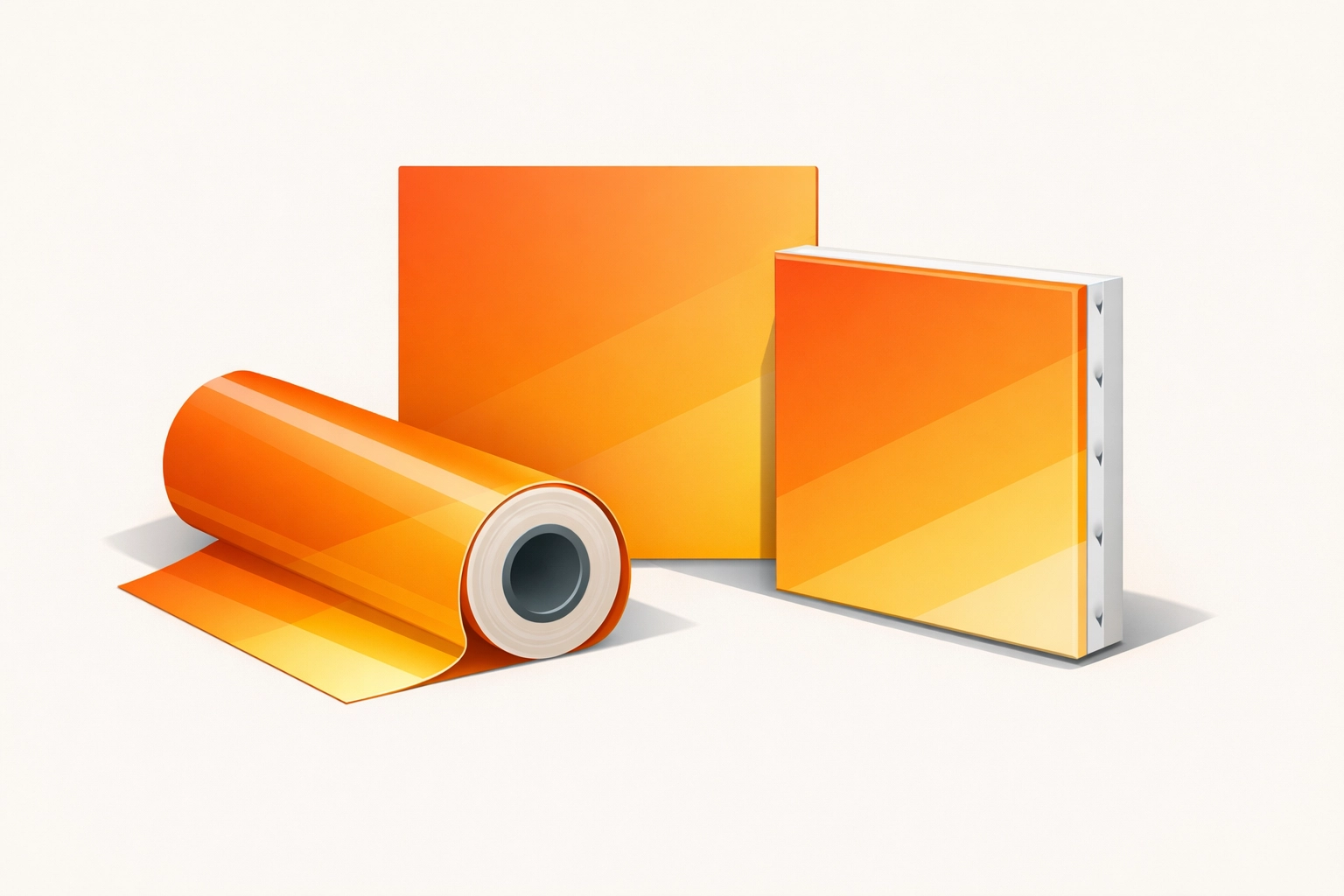
7. Choosing the Wrong File Format for the Substrate
Not all file formats are created equal for every printing method. If you are designing for a Direct to Garment (DTG) or Direct to Film (DTF) process, you often need a transparent background, which makes PNG or specialized TIFF files necessary. For large banners and signage, a vector-based PDF is the industry standard because it allows for infinite scaling of logos and text without loss of quality.
Avoid using JPEG for large format print files whenever possible. The compression algorithms used in JPEGs create "artifacts" or noise around the edges of objects. When enlarged to the size of a storefront sign, these artifacts become incredibly distracting. Stick to lossless formats like TIFF or high-quality PDF. If your project involves complex gradients, a high-bit-rate TIFF will prevent the "banding" that often occurs in lower-quality file types.
Conclusion on Technical Workflow
Successful large format printing is the result of a disciplined technical workflow. By verifying your scale, resolution, and color profiles at the beginning of the design process, you eliminate the need for costly reprints. Modern tools like the Adobe Creative Cloud suite and Affinity Designer provide the necessary controls to produce professional-grade files, but they require the designer to understand the physical reality of the printing press. Whether you are producing a simple vinyl banner or a complex mesh wrap, attention to these seven areas will ensure your vision translates perfectly from the screen to the physical world. For assistance with your next project, explore our project sitemap or contact us directly at Creative Design Hub (84G).
Works Cited
Adobe. (2024). Preparing files for large-scale printing in Illustrator. Adobe Help Center.
International Color Consortium. (2023). ICC Profile Basics for Print Production.
Onyx Graphics. (2025). Understanding Raster Image Processing and Color Gamut.
Printing United Alliance. (2024). Large Format Printing Standards and Best Practices.
Tidwell, J. (2023). Digital Printing of Textiles: DTG and DTF Workflow Analysis. Industrial Press.
Recent Comments