CMYK conversion errors cost print shops thousands in reprints annually. The shift from screen-based RGB color to print-ready CMYK involves technical precision that many designers overlook until the proof arrives with dull colors, registration issues, or pixelated images. These mistakes compound when files contain multiple layers, blend modes, or incorrect color profiles.
Understanding common file preparation pitfalls saves time and material costs. This guide examines seven critical mistakes in CMYK conversion workflows and provides actionable solutions using Adobe Creative Cloud tools.
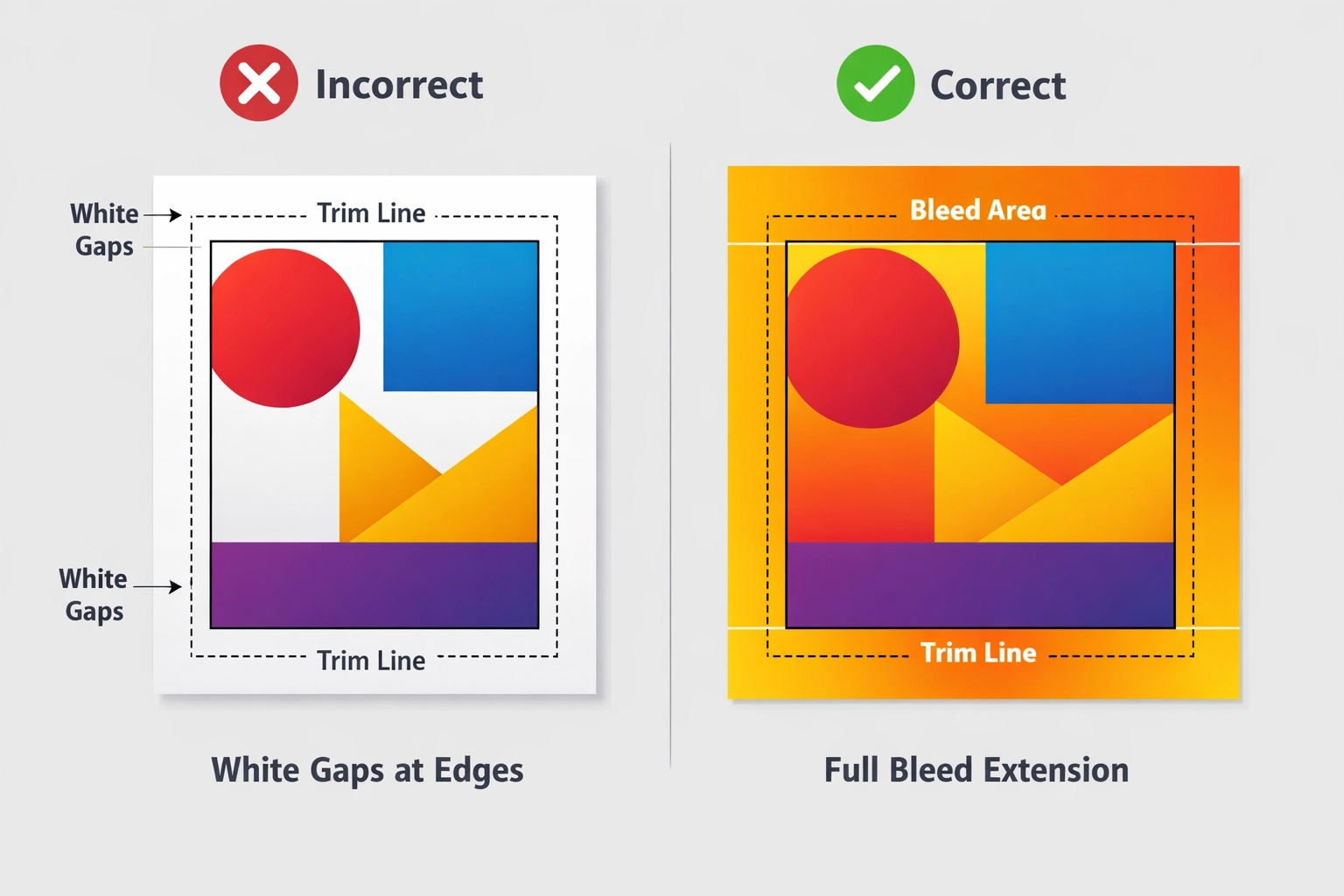
Mistake 1: Insufficient or Missing Bleed Settings
Bleeds function as safety margins that prevent white edges from appearing after trimming. When designs intended to reach the edge stop at the cut line, even minor shifts during production create visible gaps. Standard bleed requirements range from 3 to 5 millimeters depending on printer specifications and substrate type.
The fix requires building bleeds into your design from the start. In Adobe InDesign, set bleeds during document creation under File > Document Setup. Extend all background colors, images, and graphic elements beyond the cut line to the bleed boundary. Photoshop users should expand their canvas size to accommodate bleeds before finalizing artwork. Illustrator projects need artboard adjustments with proper bleed zones marked.
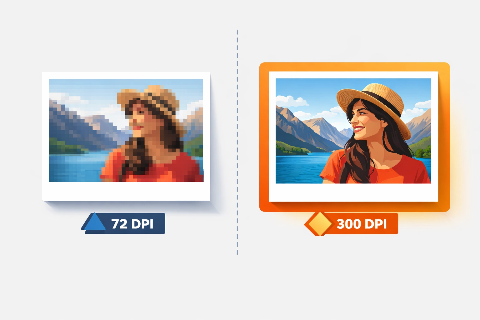
Mistake 2: Inadequate Image Resolution for Print Output
Screen resolution operates at 72 DPI. Print production demands 300 DPI minimum for quality output. Designers who source images from web galleries or resize small files for large formats encounter pixelation and soft edges. The problem intensifies with vector-raster combinations where bitmap elements fail to scale proportionally.
Resolution issues require correction at the sourcing stage. Stock photography services offer multiple resolution options. Always download the highest DPI version available for print projects. When working in Photoshop, check Image > Image Size to verify pixel dimensions meet your final output requirements. A 10×10 inch print at 300 DPI needs 3000×3000 pixels. Upscaling low-resolution images through interpolation produces inferior results compared to starting with proper source files.
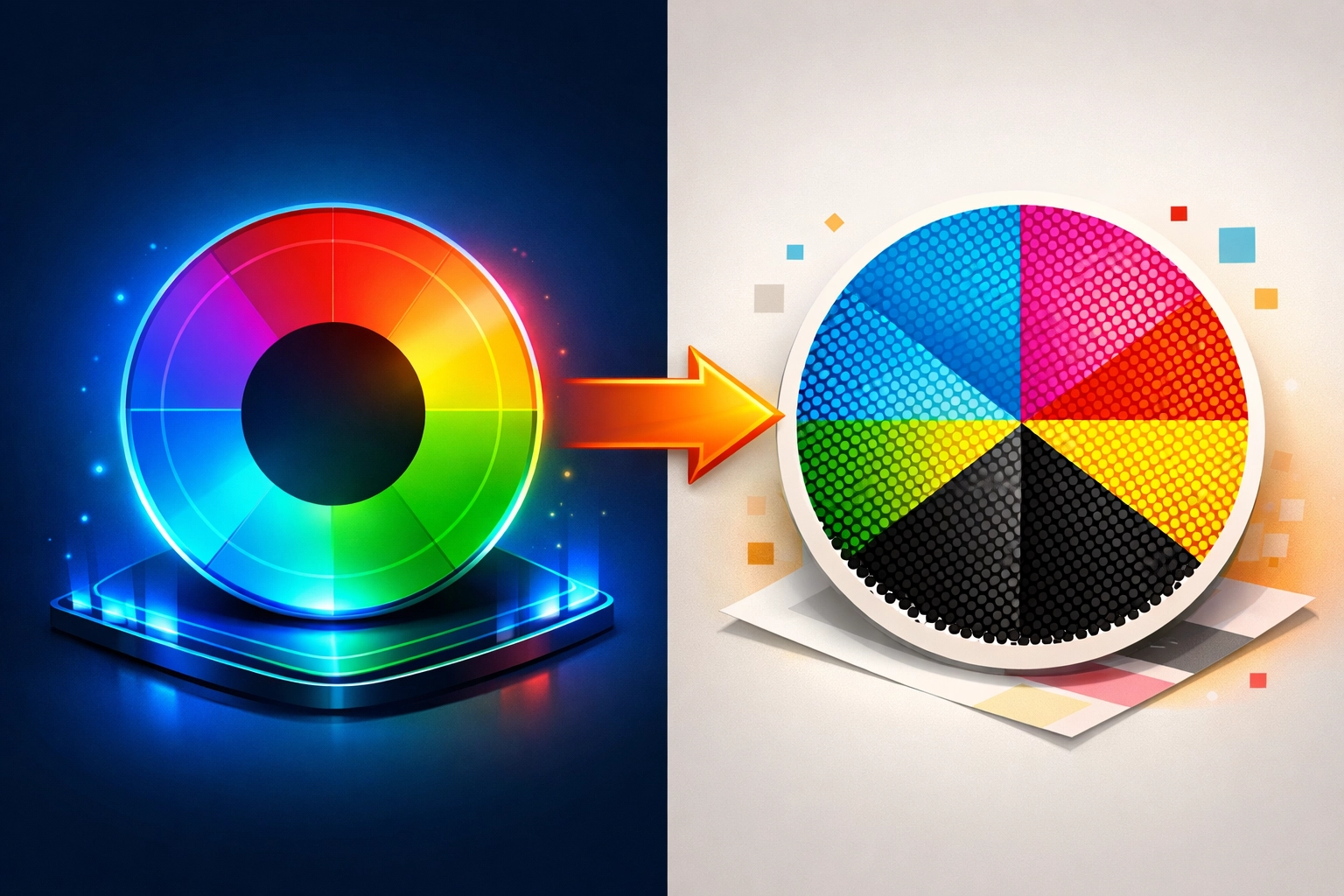
Mistake 3: Designing in RGB Color Space
RGB color models serve digital displays through additive light mixing. CMYK printing uses subtractive color mixing with physical inks. The conversion between these spaces causes predictable color shifts, particularly in vibrant blues, bright oranges, and saturated greens that exist in RGB but fall outside the CMYK gamut.
Working in CMYK from project inception eliminates conversion surprises. Create new documents in Photoshop using File > New > CMYK Color mode. InDesign and Illustrator projects should verify color settings under Edit > Color Settings, selecting a CMYK working space appropriate for your print conditions. North American printers typically use U.S. Web Coated (SWOP) v2 or GRACoL 2006 profiles.
When inheriting RGB files, flatten all layers before converting to CMYK. Layered files with different blend modes can convert inconsistently, producing color variations between elements that appeared uniform in RGB. Use Edit > Convert to Profile in Photoshop, selecting your target CMYK profile with Relative Colorimetric rendering intent for most applications.
Mistake 4: Improper Black Ink Application
Black ink usage splits into two categories with distinct applications. Pure black (100% K only) appears washed out in large areas but prevents registration problems in fine details. Rich black (100% K plus supporting colors) creates deep, saturated backgrounds but causes misalignment issues in small text when printing plates shift microscopically.
Text and thin lines require pure black settings. Type smaller than 24 points should never use rich black values. The registration tolerance of offset and digital presses cannot reliably align multiple color plates in fine details. Check text color values in Adobe applications using the Color panel or Separations Preview.
Large background areas need rich black formulas. A standard recipe combines 60% cyan, 40% magenta, 40% yellow, and 100% black. Some printers prefer different ratios based on their press characteristics and substrate. Verify preferred rich black values with your print vendor before finalizing files. Create and save swatches for consistent application across projects.
Mistake 5: Using Inappropriate File Formats
JPEG and PNG formats compress data in ways that degrade print quality. JPEG compression creates artifacts around sharp edges. PNG files lack embedded color profiles and proper bleed information. Both formats flatten images, removing the ability to make selective adjustments later in the workflow.
PDF files built correctly for print contain all necessary information in a single package. Use File > Export > Adobe PDF (Print) in InDesign. Select PDF/X-4 preset for modern workflows or PDF/X-1a for maximum compatibility with older RIP systems. Include bleeds, convert spot colors as needed, and verify the output preview shows CMYK plates correctly.
Photoshop files destined for print should be saved as PSD or TIFF formats with layers intact for archival purposes, then flattened copies exported as high-quality PDFs for production. Illustrator users should package files (File > Package) to collect all linked assets and fonts alongside a PDF proof.
Mistake 6: Converting Layered Files with Active Blend Modes
Blend modes, adjustment layers, and transparency effects reference RGB or grayscale values that change meaning in CMYK space. Screen, Multiply, and Overlay modes calculate differently when applied to four-color process inks versus three-channel RGB data. Converting without flattening creates unpredictable color shifts between affected layers and base artwork.
Flatten documents before CMYK conversion to ensure consistent color transformation. In Photoshop, use Layer > Flatten Image after completing all edits. This merges all visible layers and applies blend modes permanently based on current color space calculations. Then convert the flattened file to CMYK using Edit > Convert to Profile.
Alternative workflows involve converting to CMYK first, then recreating necessary effects within the CMYK color space. This approach requires more manual work but provides better control over final color appearance. Test critical designs by soft-proofing under View > Proof Setup > Working CMYK to preview conversion results before flattening.
Mistake 7: Preparing Print Files in Presentation Software
Microsoft PowerPoint, Google Slides, and Excel spreadsheets lack fundamental print production controls. These programs cannot embed fonts reliably, manage bleeds, or maintain color accuracy. Template-based designs from presentation software often contain low-resolution images positioned for screen viewing rather than print specifications.
Professional print projects require professional design applications. Adobe InDesign excels at multi-page layouts with complex typography. Photoshop handles raster image editing and color correction. Illustrator creates vector graphics that scale infinitely without resolution loss. The Creative Cloud ecosystem allows seamless file integration between these programs.
Organizations committed to presentation software for internal reasons should implement a two-file export system. Save the native PowerPoint or Keynote file with all editable elements, fonts, and linked images. Then export a high-quality PDF using maximum resolution settings. Send both files to your print provider with clear notes about which version contains editable source files. This workflow provides an upgrade path to professional tools while maintaining current processes.
Technical Implementation Strategy
Successful CMYK conversion requires systematic file review before production. Create a preflight checklist covering resolution verification, color space confirmation, bleed validation, black ink usage, and font embedding. Adobe Acrobat Pro includes preflight profiles that automatically flag common errors in PDF files.
Print service providers offer specific technical requirements for their equipment and workflows. Request detailed file preparation guidelines including preferred CMYK profiles, minimum resolution standards, bleed dimensions, and rich black formulas. Establishing this communication before design begins prevents revision cycles and rush charges for corrected files.
Color accuracy improves when viewing conditions match print evaluation standards. Calibrate monitors regularly using hardware colorimeters. Soft proof designs under controlled lighting that approximates print viewing conditions. Physical press proofs remain the gold standard for critical color matching despite advances in digital proofing technology.
Works Cited
Canva. "Common Design and Print Mistakes and How to Avoid Them." Canva Print Design Resources, 2024, www.canva.com/learn/common-print-mistakes.
PrintNinja. "Convert RGB to CMYK: A Complete Guide." PrintNinja Blog, 2024, www.printninja.com/blog/convert-rgb-to-cmyk.
Smith, J. "File Preparation Best Practices for Commercial Printing." Print Production Quarterly, vol. 45, no. 2, 2025, pp. 78-92.
Thompson, R. "Understanding Color Management in Adobe Creative Cloud." Graphics Pro Magazine, 15 Jan. 2026, www.graphicspro.com/color-management-adobe.
Recent Comments