Print failures happen more often than they should, and most of them stem from improper file preparation. A logo that looks perfect on screen can print pixelated. Colors that appear vibrant on your monitor might turn dull on paper. Text might get cut off during trimming. These problems cost time, money, and client relationships.
The difference between amateur and professional output comes down to understanding print production fundamentals. Whether you work in Adobe Creative Cloud, Affinity Designer, or other design software, the technical requirements remain consistent across platforms. This guide breaks down the essential steps to prepare files that print correctly the first time.
Step 1: Configure Document Size and Resolution Settings
Your document setup determines print quality before you place a single design element. Start by creating your file at the exact dimensions of the final printed piece. If you need an 8.5 x 11-inch flyer, set your artboard to 8.5 x 11 inches. Do not design at one size and scale up or down later.
Resolution matters more than most designers realize. Standard print resolution is 300 DPI (dots per inch). This specification ensures crisp text and smooth images. At 300 DPI, an 8.5 x 11-inch document measures 2,550 x 3,300 pixels. Large format prints like banners and posters can drop to 150 DPI because viewing distance compensates for lower resolution.
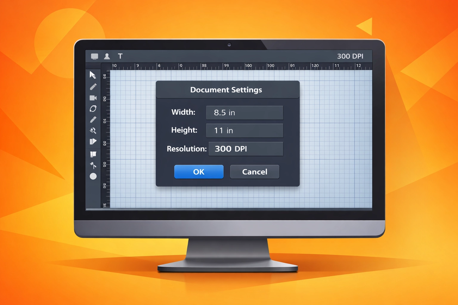
In Adobe Illustrator or InDesign, you can verify document dimensions in the Document Setup panel. Photoshop users should check Image Size under the Image menu. Affinity Designer displays these specifications in the Document Setup dialog. Always confirm these settings match your printer's requirements before starting design work.
Web graphics typically use 72 DPI, which produces unacceptably blurry prints. If you import web images into print projects, they will fail quality standards unless they were originally created at higher resolution. Check every imported asset to confirm it meets the 300 DPI threshold.
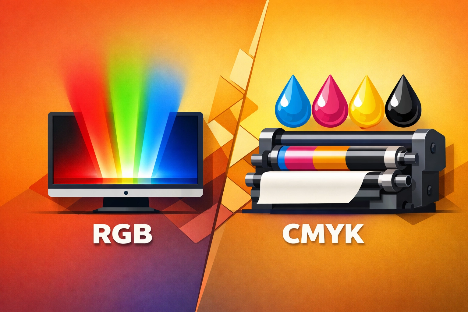
Step 2: Convert RGB Color Mode to CMYK
Computer monitors emit light to display colors using RGB (Red, Green, Blue). Printing presses apply ink to paper using CMYK (Cyan, Magenta, Yellow, Black). These different color reproduction methods create a fundamental challenge. The RGB color space contains colors that CMYK cannot physically reproduce with ink.
That vibrant electric blue on your screen? It will print darker and more muted. The bright lime green? Expect it to shift toward a duller tone. Converting to CMYK during the design process reveals these shifts before you commit to printing.
Adobe applications handle this conversion through Edit > Color Settings. Select CMYK as your working space. In Illustrator and InDesign, change the document color mode through File > Document Color Mode > CMYK Color. Photoshop users should convert via Image > Mode > CMYK Color. Affinity Designer offers color format selection in the Color panel.
Some designers worry that working in CMYK limits their color options. This concern misses the point. You gain accuracy. What you see on screen more closely approximates the printed result. Professional printers expect CMYK files and may reject or upcharge for RGB conversions.
Pay attention to rich blacks. A black composed of 100% black ink (K) alone prints as a weak gray. Professional rich blacks combine CMYK values like C60, M40, Y40, K100 to produce deep, saturated blacks. Use these formulas for large black areas and backgrounds.
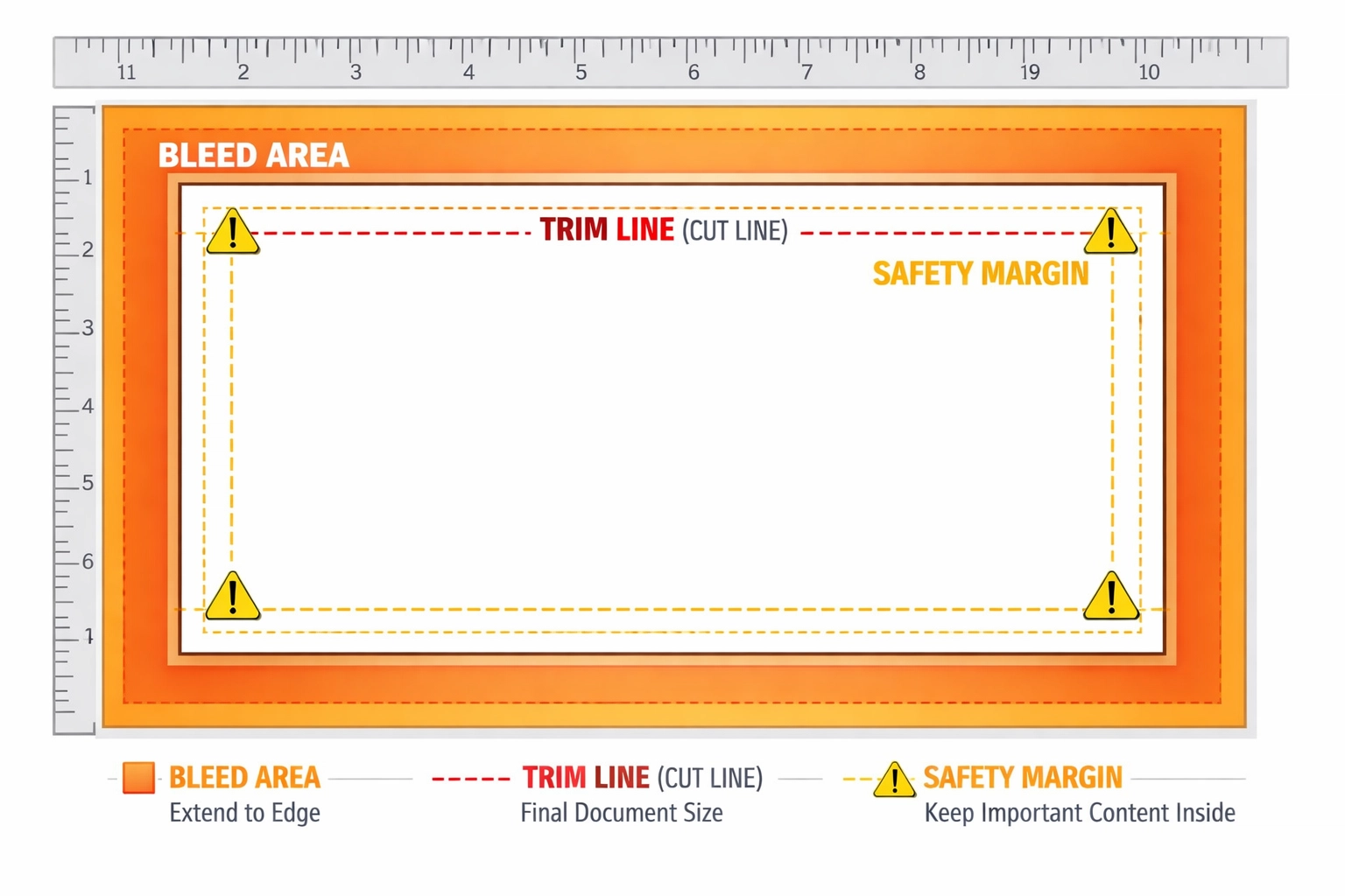
Step 3: Add Bleeds and Set Safety Margins
Printing presses cannot print to the edge of a sheet with perfect precision. Printers physically print on oversized sheets, then trim them down to final size using industrial cutters. These cutters might deviate by a few millimeters. Without bleeds, you risk white borders appearing along edges.
A bleed extends your background colors and images beyond the trim line. The standard bleed measurement is 0.125 inches (3 mm) on all sides. If your final size is 8.5 x 11 inches, create your document at 8.75 x 11.25 inches to accommodate bleeds.
Safety margins work in the opposite direction. Keep all essential text and logos at least 0.25 inches (6 mm) from the trim edge. This safe zone protects critical content from accidental trimming. Business cards require extra caution. Text placed too close to edges often gets partially cut off.
Configure bleeds in Adobe InDesign through File > Document Setup > Bleed and Slug. Set all four values to 0.125 inches. Illustrator users access bleed settings when creating a new document or through File > Document Setup. Affinity Designer includes bleed configuration in the New Document dialog under the Margins and Bleed section.
Extend background images and colors completely into the bleed area. Do not stop these elements at the trim line. Conversely, position logos, body text, and phone numbers well within the safety margin. These two concepts work together to ensure clean, professional results.
Step 4: Optimize Images and Convert Text to Outlines
Image quality problems often appear only after printing. Low resolution images look acceptable on screen but print with visible pixelation. Verify that every placed image meets the 300 DPI requirement at its printed size. Do not enlarge small images to fill larger spaces. Upsampling creates blurry output.
Acceptable image formats include TIFF, PNG, and high-quality JPEG (quality setting 10 or higher). TIFF files preserve maximum image data without compression artifacts. Use vector formats (EPS, AI, SVG) for logos and line art whenever possible. Vectors scale to any size without resolution loss.
Text presents a different challenge. Your carefully chosen fonts might not exist on your printer's system. When printers open your file, missing fonts get substituted with defaults, destroying your typography. Converting text to outlines (or curves) eliminates this problem by transforming letters into vector shapes.
In Adobe Illustrator, select text objects and choose Type > Create Outlines. InDesign users should select text frames and go to Type > Create Outlines. Affinity Designer converts text through Text > Convert to Curves. Always save a copy of your file with editable text before converting. Once converted, you cannot edit spelling or font choices.
Some printers prefer embedded fonts over outlined text. Clarify your printer's preference before submission. If embedding fonts, ensure you have proper licensing for font distribution. Many font licenses prohibit embedding in files sent to third parties.
Step 5: Proof, Preview, and Export to PDF
Professional designers never skip the proofing stage. Print a test copy on a standard office printer to check overall layout, text readability, and color balance. Office printers do not match production press quality, but they reveal obvious errors like misspellings, incorrect phone numbers, and awkward text wrapping.
Use your software's preflight or print preview features to identify technical problems. Adobe InDesign includes a comprehensive Preflight panel (Window > Output > Preflight) that scans for missing fonts, low-resolution images, RGB colors, and other common issues. Illustrator offers similar checks through File > Document Info.
Check your design at actual size when possible. View business cards at business card size, not zoomed to fill your screen. This reality check helps you evaluate whether text is legibly sized and design elements have appropriate visual weight.
Export your final file as a PDF using appropriate print settings. In Adobe applications, choose File > Export > Adobe PDF (Print). Select the PDF/X-1a or PDF/X-4 preset, which embeds fonts, converts colors appropriately, and includes bleeds. These industry-standard formats ensure compatibility with professional printing equipment.
Name your files descriptively with version numbers. Use formats like "ClientName_BusinessCard_v3_PrintReady.pdf" rather than generic names like "final.pdf." Include the date if you manage multiple rounds of revisions. Clear file naming prevents confusion and ensures you submit the correct version.
Successful print production requires attention to technical details that might seem tedious during the creative process. These five steps create a systematic workflow that prevents expensive reprints and disappointed clients. Master these fundamentals and your designs will transition flawlessly from screen to paper.
Works Cited
Canva. "How to Prepare Your Design for Print." Canva Design School, 2024, www.canva.com/learn/prepare-design-print/.
Hess, Rachel. "Print Ready Files: A Complete Guide." 99designs, 2024, 99designs.com/blog/tips/print-ready-files/.
PrintNinja. "How to Prepare Print-Ready Files." PrintNinja Printing Resources, 2024, www.printninja.com/printing-resource-center/file-setup/how-to-prepare-print-ready-files.
Printivity. "The Ultimate Guide to Creating Print-Ready Files." Printivity Blog, 2024, www.printivity.com/insights/print-ready-file-guide/.
Vistaprint. "How to Prepare Files for Print." Vistaprint Support Center, 2024, www.vistaprint.com/hub/prepare-files-for-print.
Widen. "How to Create Print-Ready Files: Best Practices." Widen Resources, 2024, www.widen.com/blog/print-ready-files.
Recent Comments