Print production failures rarely happen at the press. They happen at your workstation, buried in Illustrator files that look perfect on screen but fall apart the moment they hit prepress. These aren't theoretical problems. They're the mistakes that cause reprints, blow deadlines, and drain budgets.
If you've ever received a proof that looked nothing like your screen, or paid for a reprint because of preventable technical errors, you already know the cost. The good news is that most file prep failures follow predictable patterns. Fix these seven mistakes in your workflow, and you'll eliminate the majority of print production problems before they reach the RIP.
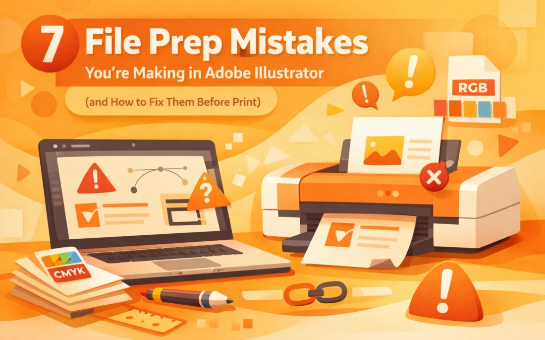
1. Leaving Fonts Live Instead of Outlining Them
When you send an Illustrator file with live text to a print shop, you're assuming they have your exact font files installed. That assumption fails more often than it should. If the receiving system can't locate your font, Adobe substitutes it automatically with a default typeface. Your carefully kerned headlines become generic system fonts, and your brand typography disappears entirely.
The solution is straightforward but requires discipline. Before you package files for output, select all text objects and convert them to outlines. Navigate to Type > Create Outlines, or use the keyboard shortcut Shift+Command+O (Mac) or Shift+Control+O (Windows). This converts your text from editable type to vector shapes, locking the letterforms permanently.
One caveat: outlining is destructive. Save a working copy of your file with live text before you outline anything. You'll need that editable version if client revisions come back, because outlined text can't be edited as type anymore. It's now a collection of anchor points and bezier curves.
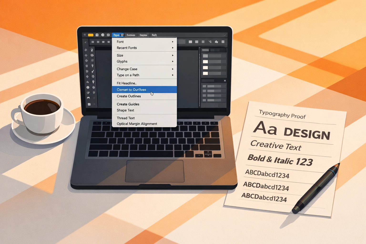
2. Using Default Black Instead of Rich Black
Not all blacks are created equal. When you select black from the default color picker in Illustrator, you're typically getting 100% K (key plate) with no supporting cyan, magenta, or yellow. This produces a flat, grayish black that looks weak in print, especially on coated stocks. It's fine for body text at small point sizes, but it fails for large areas, backgrounds, or any design element where black needs to feel solid and rich.
Rich black solves this by building depth with supporting process colors. A standard rich black formula runs 60C/40M/40Y/100K, though variations exist depending on press conditions and paper stock. This creates a black with actual density and visual weight.
The trade-off is registration. Rich black requires four plates to align perfectly. If your job involves heavy ink coverage or you're printing on an older press with registration concerns, consider whether the visual improvement justifies the risk. For most commercial work, it does. For newsprint or low-budget projects, standard black may be the safer choice.
Build rich black as a global swatch in your color panel so you can apply it consistently across all design elements. Never assume your print provider will adjust black values automatically.
3. Ignoring Bleed Requirements
Bleed is the insurance policy against white edges. When artwork is designed to run off the page, it must extend beyond the final trim line. Standard bleed is 0.125 inches (1/8 inch) on all sides, though some printers request 0.25 inches for perfect-bound books or specialty finishing.
The problem isn't that designers don't know about bleed. It's that they build files at finished size and try to add bleed afterward, or they create bleed but don't extend their design elements into it. Both approaches fail. If your background or image stops at the trim line and the cutter shifts even slightly during finishing, you'll get a white strip along the edge of your printed piece.
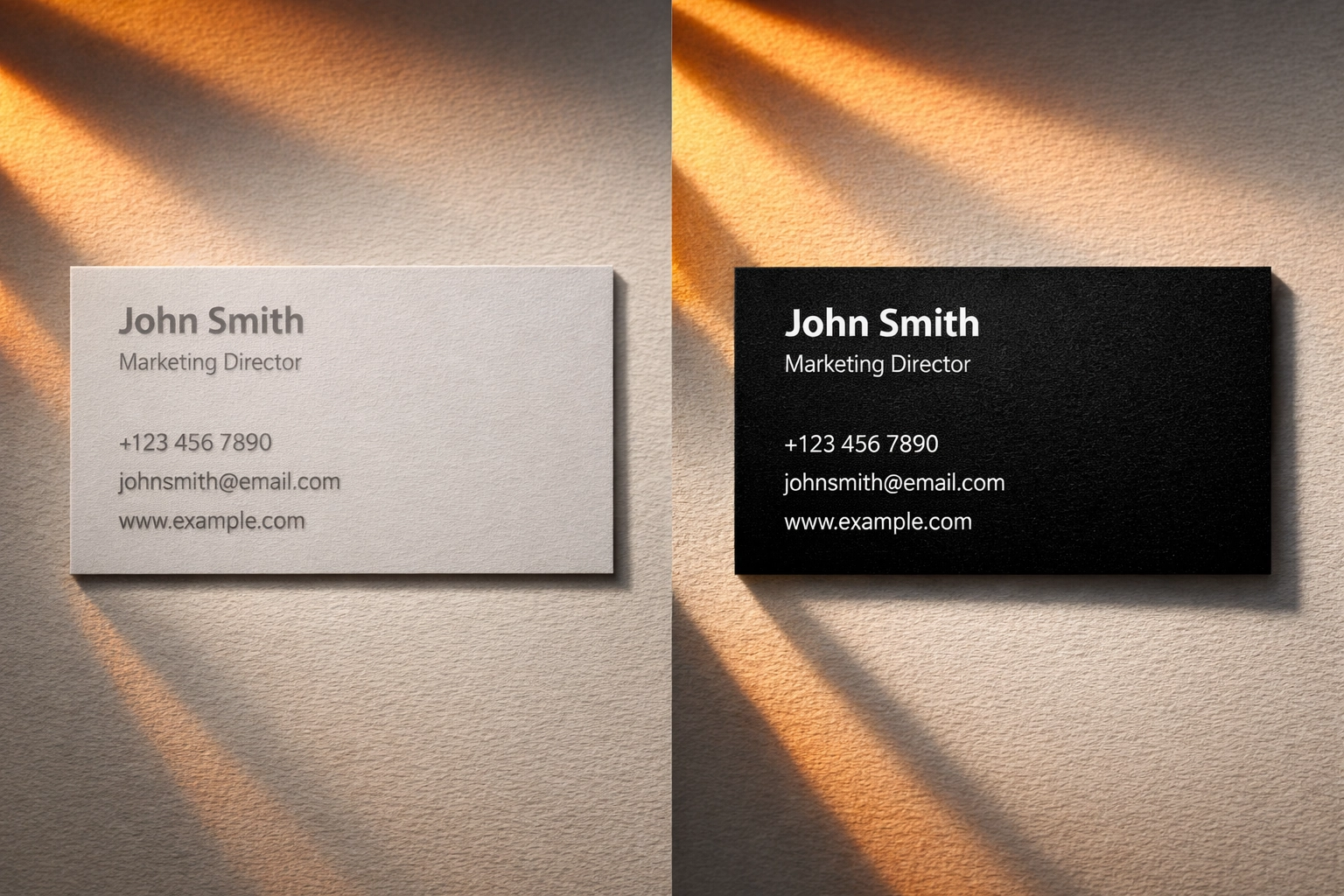
Set up bleed correctly from the start. When you create a new document in Illustrator, use File > New and enter your bleed values in the document setup dialog. Your artboard displays the trim size, and Illustrator adds a red bleed guide outside that boundary. Extend all full-bleed elements past the trim line to this red guide. Keep essential elements (text, logos, anything that can't be cropped) at least 0.125 inches inside the trim line. This safety margin is called the live area or safe zone.
When you export your PDF, verify that bleed settings are included in the export dialog. A PDF without embedded bleed information is worthless for print production.
4. Designing in RGB Color Mode
Illustrator defaults to RGB color mode because most users work on screen-based projects. But RGB color (red, green, blue) is an additive color model designed for backlit displays. Print uses CMYK (cyan, magenta, yellow, key), a subtractive color model based on ink pigments and reflected light. The two color spaces don't map to each other cleanly. Bright RGB colors often have no CMYK equivalent, and the conversion process usually produces disappointing results.
If you design a project in RGB and convert it to CMYK at output, you're letting the RIP software make critical color decisions. Different RIPs handle RGB-to-CMYK conversion differently, which means you lose control over color accuracy. That vibrant RGB blue you spent twenty minutes adjusting may convert to a muddy purple in CMYK, and by the time you see it on a proof, it's too late to fix without rebuilding sections of your file.
The fix is simple: work in CMYK from the beginning. Check your color mode under File > Document Color Mode. If it shows RGB, switch it to CMYK and reassess your colors. Some will shift noticeably. This is good. You're seeing the shift at your workstation instead of discovering it on press.
For projects that require specific brand colors, work with spot colors (PMS) instead of process builds. Spot colors use premixed inks that maintain color consistency across different substrates and printing methods.
5. Linking Images Instead of Embedding Them
Illustrator handles raster images (JPEGs, PNGs, TIFFs) by either linking to external files or embedding them directly in the document. Linking keeps file sizes smaller and allows you to update images by replacing the source file. But linked images create dependencies. If you move the Illustrator file to a different folder, send it to a collaborator, or transfer it to a print shop without including the linked image files, those images vanish. Illustrator replaces them with low-resolution screen previews or leaves empty boxes with broken link icons.
Embedding prevents this. When you embed an image, Illustrator incorporates the full-resolution data directly into the AI file. The file gets larger, but it becomes self-contained. Everything needed for output travels in a single file.
Before you send files to print, open the Links panel (Window > Links) and check for any linked images. Select each linked image and click the hamburger menu in the panel's top-right corner, then choose Embed Image. Alternatively, embed all linked files at once by selecting them in the Links panel and choosing Embed Images from the panel menu.
Keep resolution in mind. Embedded images should be at least 300 DPI at final output size for quality print reproduction. Lower resolution images will print, but they'll look soft or pixelated.
6. Attempting Print Production in Non-Print Software
This mistake happens less in Illustrator and more when people try to bypass professional design software entirely. PowerPoint, Excel, Canva, and similar tools are built for screen output or basic desktop printing. They lack proper color management, bleed handling, font embedding, and high-resolution export capabilities.
If you receive a "print-ready" file built in PowerPoint, you're not holding a print-ready file. You're holding a screen presentation that will cause problems at every stage of prepress. Colors won't match expectations. Fonts will substitute. Images will appear pixelated. Bleed won't exist.
The correct workflow uses purpose-built tools. Illustrator handles vector-based design work. InDesign manages multi-page layouts. Photoshop processes raster images. These applications provide the precision controls, color management systems, and export standards that commercial printing requires.
If you must work with files from non-print applications, don't send the native file to your printer. Export the highest-quality PDF the software allows, but communicate clearly with your print provider about the file's origins. They may be able to salvage it, but they need to know what they're working with.
7. Skipping the Final Spellcheck
Typography errors don't technically qualify as file prep mistakes, but they destroy print jobs just as effectively as bad bleeds or wrong color modes. The problem is visibility. Your brain autocorrects errors when you've been staring at the same layout for hours. You see what should be there instead of what actually is there.
Illustrator includes a spellcheck function under Edit > Check Spelling, though it's less robust than InDesign's editorial tools. Run it anyway. Better yet, export your text and run it through dedicated proofreading software like Grammarly or ProWritingAid. Print a hard copy and review it away from your screen. Read backwards, sentence by sentence, to catch errors your forward-reading brain skips over.
Have someone else proof your work. Fresh eyes catch mistakes you've trained yourself to overlook. Budget time for this review before deadlines. Rushing the proof stage guarantees errors will slip through.
The cost of fixing a typo on press is exponentially higher than catching it at your desk. Once plates are made or a digital press starts running, corrections require stopping production, rebuilding files, and reprinting. These aren't minor inconveniences. They're budget killers.
The Preflight Check You Should Run Every Time
Illustrator's built-in preflight capabilities are limited compared to InDesign, but you can still catch major errors before output. Before you export final PDFs, review your file systematically. Check your color mode. Verify bleed extends properly beyond the artboard. Confirm all fonts are outlined. Make sure all images are embedded and high-resolution. Export a PDF with proper bleed settings, then open that PDF and zoom to 300% or 400% to inspect edges, text, and image quality.
This process takes ten minutes. It prevents problems that cost hundreds or thousands of dollars to fix after printing. Make it part of your standard workflow, not an optional step you skip when deadlines get tight. That's when mistakes happen.
These seven errors represent the majority of preventable print production failures. They're not creative problems. They're technical problems with technical solutions. Fix them systematically, and you'll reduce your reprint rate, improve color consistency, and build better relationships with print providers who won't need to call you with file problems at 4:00 PM on press day.
Works Cited
Adobe Systems Incorporated. (2024). "Prepare Illustrator artwork for print." Adobe Illustrator User Guide. Retrieved from https://helpx.adobe.com/illustrator/using/preparing-artwork-print.html
Matteson, K. (2023). "Common file preparation mistakes and how to avoid them." Printing Impressions, 65(8), 34-37.
National Association for Printing Leadership. (2024). "Print file specifications and standards guide." NAPL Technical Standards Documentation, 2024 Edition.
Recent Comments