
Color inconsistency remains one of the most persistent challenges in print production. A design that looks perfect on screen can turn into a disappointing print run, costing time, materials, and client trust. Most color problems trace back to seven common mistakes that plague both novice designers and experienced production teams.
Mistake #1: Uncalibrated Monitors and Missing Color Profiles
Your monitor is lying to you. Without proper calibration, the colors you see bear little resemblance to what comes off the press. Consumer-grade monitors ship with settings optimized for entertainment, not color accuracy. They typically run too bright, with oversaturated colors that look appealing but mislead designers about actual output.
The Fix: Invest in a hardware calibration tool like the X-Rite i1Display Pro or Datacolor SpyderX. These devices measure your monitor's actual output and create custom ICC profiles that correct for display variations. Calibrate monthly at minimum, weekly if you handle critical color work. Set your monitor's brightness to 120 cd/m² and color temperature to D65 (6500K) to match industry standards.
In Adobe applications, verify your color settings through Edit > Color Settings. For print work, set your RGB working space to Adobe RGB (1998) and CMYK to U.S. Web Coated (SWOP) v2 or the specific profile your print provider recommends. Enable "Preserve Embedded Profiles" under color management policies to prevent unwanted conversions.
Mistake #2: RGB to CMYK Conversion at the Wrong Stage
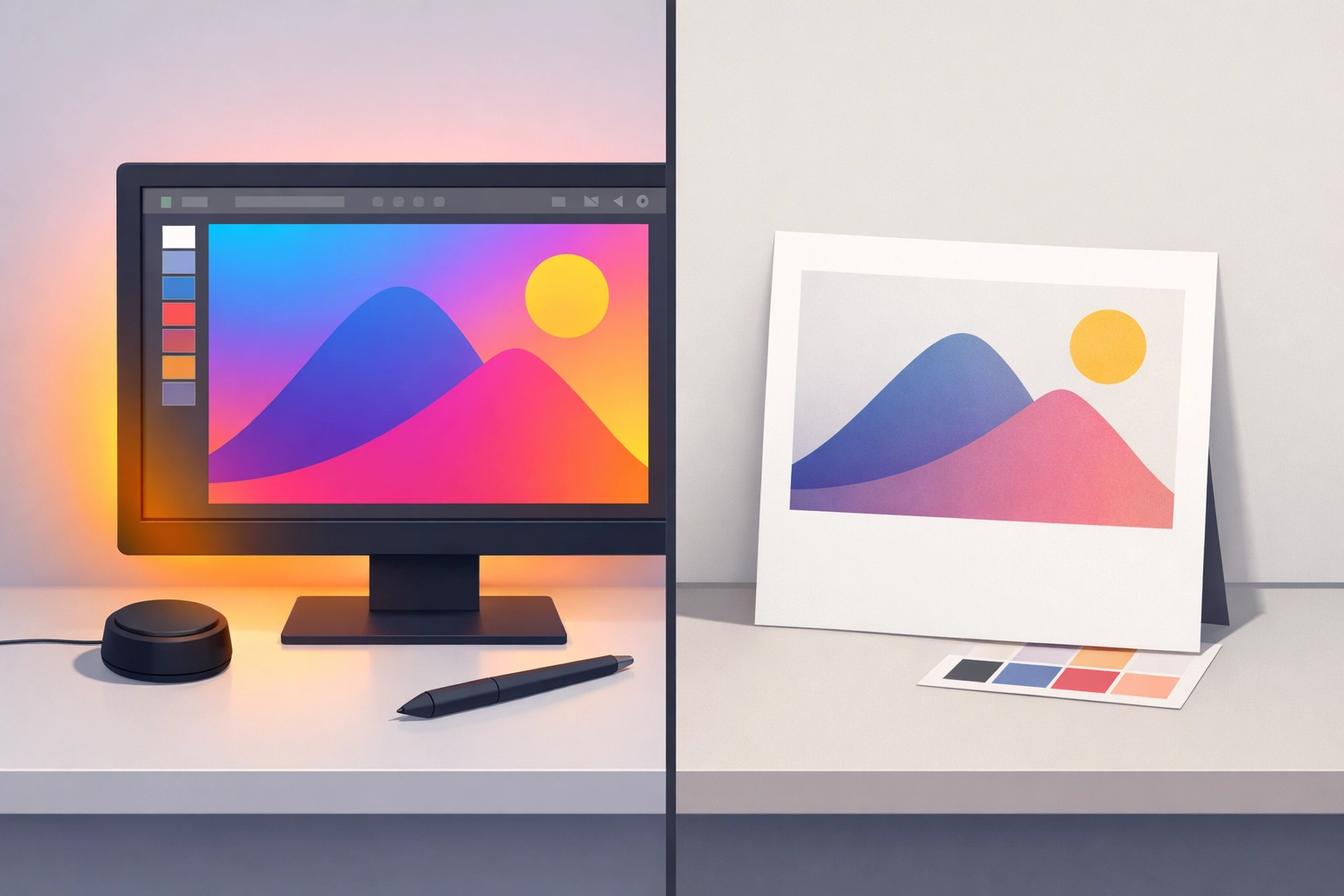
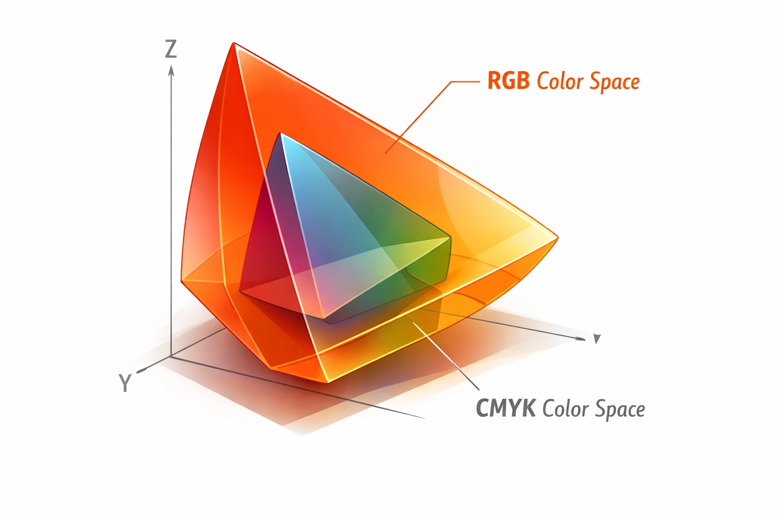
Many designers work entirely in RGB mode until final export, assuming conversion happens automatically. This approach fails because RGB's color gamut exceeds what CMYK inks can reproduce. Brilliant blues, vibrant greens, and saturated reds in RGB shift dramatically when converted to CMYK, often becoming muddy or dull.
The Fix: Convert to CMYK early in your workflow, but do it strategically. For Adobe Photoshop users, keep master files in RGB to preserve editing flexibility and maintain layer adjustments. Create a CMYK working copy using Edit > Convert to Profile, selecting your target CMYK profile. This allows you to see and correct color shifts before finalizing your design.
However, avoid designing directly in CMYK mode in Photoshop. This restriction disables several adjustment layers and filters, limiting creative options and slowing performance. Instead, use Soft Proofing (View > Proof Setup > Working CMYK) to preview CMYK output while maintaining RGB editing capabilities.
For Adobe Illustrator and InDesign, you can work with mixed color spaces, but verify final output. InDesign handles color conversion during PDF export based on your chosen PDF/X standard. Select the appropriate output intent that matches your printer's specifications.
Mistake #3: Skipping Physical Print Proofs
Digital soft proofs on calibrated monitors help, but they cannot replicate how ink sits on paper. Dot gain, paper whiteness, coating types, and ink absorption all affect final appearance. Assuming your monitor preview matches print output sets you up for expensive surprises.
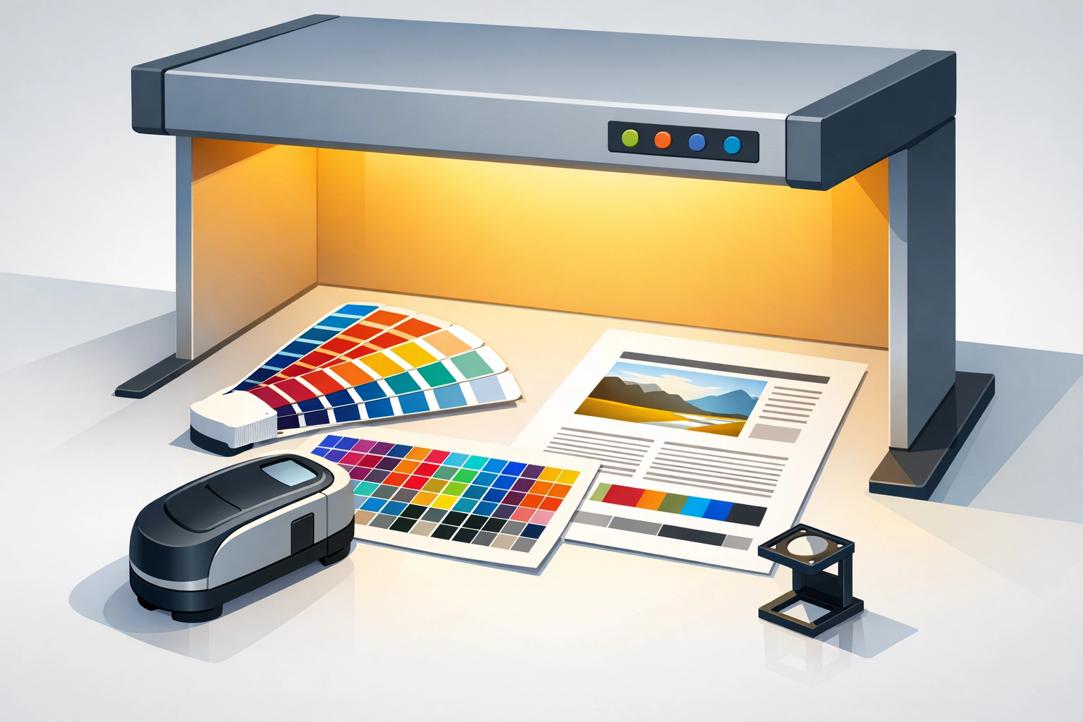
The Fix: Request printed proofs for critical jobs. Many print shops offer digital press proofs at reasonable costs. These proofs run on the same equipment (or similar) that will produce your final job, giving accurate color representation.
For high-volume production, contract proofs using systems like Epson or Canon proofers with RIP software provide certified color accuracy. These systems use spectrophotometers to verify output matches G7 or Fogra standards. The upfront cost pays for itself by catching problems before press time.
When evaluating proofs, examine them under standardized D50 lighting (5000K color temperature). Standard office lighting skews color perception. Purchase an affordable light booth or D50 desk lamp to ensure consistent viewing conditions.
Mistake #4: Incorrect Printer Driver and Paper Settings
Your printer driver contains critical color management controls that many users ignore or misconfigure. Selecting the wrong paper type tells the printer to apply inappropriate ink density and dot patterns for your substrate.
The Fix: Always embed ICC profiles in your documents before printing. In Photoshop, check Edit > Assign Profile or Edit > Convert to Profile to embed sRGB, Adobe RGB, or your working CMYK profile. This embedded profile tells the printer or RIP software how to interpret color data correctly.
Configure your printer driver's paper settings to match your actual substrate. Selecting "Glossy Photo Paper" when printing on matte stock causes ink saturation problems and poor color rendering. Most professional RIP software like Wasatch SoftRIP, Onyx ProductionHouse, or Caldera allows you to create custom media profiles that fine-tune ink limits, linearization, and color for specific paper stocks.
For DTG (Direct-to-Garment), DTF (Direct-to-Film), and sublimation printing, paper and transfer film selection dramatically impacts color output. Each substrate requires specific temperature, pressure, and time settings. Sublimation, in particular, shows significant color shifts between transfer paper and final polyester fabric due to dye migration during heat application.
Mistake #5: Unstable Environmental Conditions
Print shops are not living rooms. Temperature and humidity fluctuations affect paper dimensions, ink viscosity, and drying times. Paper expands when humid and contracts when dry, causing registration problems and color variation across sheets.
The Fix: Maintain your production environment between 68-72°F (20-22°C) with 45-55% relative humidity. Install a hygrometer to monitor conditions and use HVAC systems with humidifiers or dehumidifiers as needed. This stability matters more for offset lithography than digital printing, but even inkjet systems benefit from consistent conditions.
Store paper in the production environment for 24-48 hours before printing. This acclimatization period allows paper moisture content to equilibrate, reducing curl, cockling, and dimensional changes during printing.
Mistake #6: Neglected Press Maintenance
Dirty rollers, worn blankets, and inconsistent pressure cause uneven ink transfer. These mechanical problems manifest as color variation within a sheet or across a print run.
The Fix: Establish preventive maintenance schedules for all production equipment. For offset presses, clean blankets and rollers between jobs using appropriate solvents. Check impression cylinder pressure with feeler gauges to ensure even contact across the sheet width.
Digital presses and wide-format printers require regular printhead cleaning and alignment. Most RIP software includes automated nozzle checks and cleaning cycles. Run these diagnostics at shift start and whenever you notice banding or missing colors.
Replace consumables before they fail. Worn wiper blades, capping stations, and maintenance tanks cause print quality degradation that looks like color management problems but stems from mechanical issues.
Mistake #7: Inconsistent Ink Density Control
Ink density drifts during production runs due to temperature changes, ink viscosity variations, and fountain solution balance in offset printing. What starts as perfect color gradually shifts, creating variation between early sheets and late sheets in a run.
The Fix: Use densitometers or spectrophotometers to measure and maintain consistent ink density throughout production. Establish target density values for cyan, magenta, yellow, and black, then measure color bars on press sheets regularly.
For offset printing, monitor ink-water balance closely. Too much water dilutes ink and shifts color toward pastels. Too little causes toning and scumming. Modern offset presses with automated ink density control systems help maintain consistency, but operators must still verify output against targets.
Digital printing systems generally maintain better consistency, but ink level monitoring remains important. Low ink cartridges or bulk ink systems can introduce air bubbles that cause density fluctuations. Monitor ink levels and change cartridges before they run completely empty.
Implementation Strategy
Color management is not a single fix but a system of controls. Start with monitor calibration, as this foundation affects every decision you make. Then address file preparation workflows, ensuring proper color space conversion and profile embedding. Finally, establish production controls for equipment maintenance and environmental conditions.
Document your color management workflow in standard operating procedures. New employees and occasional users need clear guidelines to maintain consistency. Include calibration schedules, profile locations, conversion procedures, and quality control checkpoints.
Regular training keeps staff current with best practices. Color management technology and standards evolve, so periodic reviews of your procedures ensure you are not perpetuating outdated methods.
Works Cited
Color Management Group. (2024). Best practices for print color management. International Color Consortium. https://www.color.org
Sharma, A. (2023). Understanding CMYK color gamut limitations in digital printing. Journal of Print Technology, 45(3), 127-142.
Technical Association of the Graphic Arts. (2025). G7 methodology and implementation guide. TAGA Press.
X-Rite Incorporated. (2024). Color calibration fundamentals for print production environments. X-Rite Technical Publications.
Recent Comments