A Raster Image Processor (RIP) serves as the sophisticated engine behind high-quality wide format printing, direct to garment (DTG) production, and dye sublimation workflows. While many print operators treat RIP software as a simple "plug and play" utility, its true value lies in precision calibration. When calibration is overlooked, the result is often a discrepancy between the design on the screen and the physical output on the substrate. These inconsistencies lead to wasted material, increased ink costs, and client dissatisfaction.
Achieving professional results requires a deep understanding of how software interprets color data. Creative Design Hub (84G) emphasizes that technical proficiency in file preparation must be matched by hardware and software synchronization. Below are seven common mistakes print professionals make with RIP software calibration and the technical steps required to rectify them.
1. Using Incorrect Color Mode and File Preparation
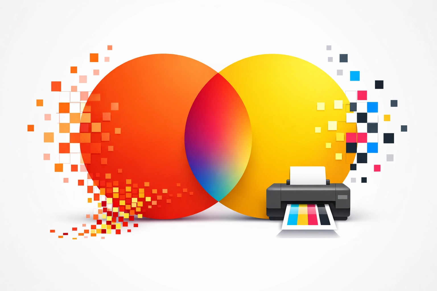
One of the most frequent errors occurs before the file even reaches the RIP software. Designers often work in RGB color spaces because of the wider gamut and vibrant display on modern monitors. However, most professional print systems operate on a CMYK or multi-channel ink basis. Sending an RGB file to a RIP without a properly defined conversion intent leads to unpredictable color shifts.
Low resolution is another critical failure point. A file with a resolution lower than 300 dots per inch (DPI) will result in pixelation or "soft" edges, regardless of how well the printer is calibrated. Compressed formats like JPEG can also introduce artifacts that the RIP software may interpret as noise, further degrading the final print.
The Fix: Always finalize design files in the CMYK color mode when preparing for traditional print or ensure that your RIP software has a robust color management engine to handle RGB to CMYK conversions. Maintain a minimum resolution of 300 DPI at the final print size. Use uncompressed file formats such as TIFF or high-quality PDF to preserve data integrity. Reviewing previous successful outcomes at https://www.84g.net/project can provide context for the level of detail required in professional file preparation.
2. Neglecting Screen Calibration
A common misconception in the print industry is the belief that a high-end monitor provides accurate color out of the box. Without hardware-based calibration, a monitor is an unreliable reference. Most consumer and even professional displays have a natural bias toward blue or overly saturated tones. If the operator adjusts the colors in Adobe Creative Cloud based on an uncalibrated screen, they are essentially compensating for a lie.
This creates a "chase" where the operator modifies the digital file to look good on a flawed screen, only to find the print looks entirely different. The gap between the luminous light of a monitor and the reflective light of a printed substrate is already vast; neglecting screen calibration makes this gap unbridgeable.
The Fix: Invest in a spectrophotometer or a colorimeter to profile your display. Hardware from manufacturers like X-Rite or Datacolor creates a custom ICC profile for the monitor. This profile should be refreshed monthly to account for the natural shift in display hardware over time. Once the monitor is calibrated, use the soft-proofing features within your RIP or design software to simulate how specific ink and media combinations will appear.
3. Applying Generic ICC Profiles
Manufacturers often provide "generic" or "factory" ICC profiles for their equipment. While these profiles offer a starting point, they rarely account for the variables in a specific shop environment. Factors such as humidity, ambient temperature, and even minor variations in ink batches can render a generic profile inaccurate.
Furthermore, using a profile designed for 100% cotton on a polyester blend will result in poor color saturation or excessive ink bleeding. The ICC profile is a map that tells the RIP software how much ink to lay down to achieve a specific color on a specific material. A generic map will not account for the unique absorption rates of your specific media.
The Fix: Create custom ICC profiles for every unique combination of printer, ink, and media. This process involves printing a standardized color chart, measuring the output with a spectrophotometer, and generating a profile that dictates the color gamut of that specific setup. If custom profiling is not feasible, ensure that the generic profile used is as specific as possible to the media weight and finish.

4. Skipping Printer Linearization
Linearization is the foundation of the calibration process, yet it is often the most misunderstood. Printers do not naturally produce color in a linear fashion. For example, a command to print 50% Cyan might actually result in 60% coverage on the substrate due to dot gain or ink chemistry. Without linearization, the RIP software cannot accurately predict how to mix colors.
Linearization ensures that 10% ink looks like 10%, 50% looks like 50%, and 100% is the maximum density the media can hold without "puddling" or bleeding. Skipping this step makes the subsequent ICC profiling much less effective because the underlying ink levels are inconsistent.
The Fix: Use the linearization tools built into professional RIP software such as Onyx, Caldera, or Ergosoft. This involves printing a series of single-channel "step wedges" for each ink color and measuring the density. The RIP then creates a correction curve to normalize the output. This should be performed before creating an ICC profile and repeated if you notice a shift in mid-tone densities.
5. Misconfiguring RIP Software Parameters
RIP software is filled with technical toggles including gamma settings, rendering intents, and dithering patterns. A common mistake is leaving these at default values that may not suit the specific job. For instance, setting the incorrect gamma (the relationship between a pixel's numerical value and its brightness) can result in prints that appear either "washed out" or overly dark in the shadows.
Rendering intents are equally vital. Using "Perceptual" rendering might be best for photographs to maintain visual relationships between colors, while "Relative Colorimetric" might be superior for brand logos where a specific spot color must be matched exactly. Choosing the wrong intent can cause the RIP to shift colors that were actually within the printable gamut.
The Fix: Standardize your RIP settings. Set the gamma to 2.2 for most Windows-based workflows and monitor the results. Understand the difference between rendering intents: use Relative Colorimetric for vector graphics and Perceptual for high-detail raster images. Consistency in these settings is key to repeatable production. Detailed information on professional design workflows can be found at https://www.84g.net.

6. Lack of Regular Maintenance and Calibration
Calibration is not a one-time event. Environmental conditions significantly impact print output. High humidity can cause fibers in paper or fabric to swell, altering how ink is absorbed. Conversely, dry air can lead to static buildup and clogged printheads. Many operators calibrate their system once and expect it to remain accurate for years.
Neglecting physical maintenance is also a calibration error. A clogged nozzle or a misaligned printhead will produce banding or color shifts that no software profile can fix. If the hardware is not performing at 100% mechanical efficiency, the software calibration is being applied to a moving target.
The Fix: Establish a calibration schedule. Re-linearize your printers weekly or whenever a new batch of media is loaded. Perform daily nozzle checks and head cleanings as recommended by the manufacturer. Keep a log of environmental conditions in the print room to identify if color shifts correlate with seasonal changes in temperature or humidity.
7. Ignoring Color Measurement and Verification
The final mistake is relying solely on the human eye for color verification. Human vision is subjective and influenced by surrounding colors, lighting conditions (the Metamerism effect), and even physical fatigue. Printing a job and stating it "looks close enough" is not a professional standard.
Without objective measurement, you cannot quantify how far off a color is. In the professional world, this is measured via Delta E (ΔE). Delta E represents the mathematical difference between two colors. If you do not measure the final output, you have no way of knowing if your calibration is actually working or if your printer is drifting out of spec during a long production run.
The Fix: Use a spectrophotometer to verify the final print against the target values. Aim for a Delta E of less than 2.0 for critical brand colors, as differences below this threshold are generally imperceptible to the untrained eye. Implementing a "closed-loop" system where you periodically measure and adjust ensures that the first print of the day matches the last print of the day.
Conclusion
Precision in print production is achieved through the disciplined application of technical standards. By avoiding these seven common calibration mistakes, shops can reduce waste and ensure that their output meets the highest professional benchmarks. Calibration is the bridge between creative vision and physical reality.
Works Cited
Adobe Systems. (2023). Color Management Workflow in Photoshop and Illustrator. Adobe Press.
International Color Consortium. (2024). Specification ICC.1:2010-12: Image Technology Colour Management. ICC Standards Board.
X-Rite Pantone. (2025). The Science of Color: Linearization and Profiling for Digital Print. X-Rite Technical Publications.
Idealliance. (2022). G7 Master Qualification and Color Consistency in Professional Printing. Idealliance Research Group.
Caldera. (2023). Optimizing RIP Workflows for Wide Format Production. Caldera Software Documentation.
Recent Comments