Production delays cost time and money. Most print production issues stem from improperly prepared files rather than equipment malfunctions or printer error. Adobe Illustrator remains the industry standard for vector-based print design, but even experienced designers can overlook critical file preparation steps that send projects back to square one.
This guide breaks down the five essential steps to create print-ready files that meet professional production standards. Each step addresses common problems that cause delays, from color space mismatches to font substitution errors.
Step 1: Configure Document Settings Before You Begin
Starting with correct document specifications saves substantial rework time. Open a new document in Illustrator and access the Advanced Options dropdown before placing any design elements. Set your color mode to CMYK Color instead of RGB. This matches the four-color printing process used by commercial printers and prevents unexpected color shifts during production.
Configure raster effects to 300 pixels per inch (ppi) as your baseline resolution. This setting affects how Illustrator renders effects like drop shadows, glows, and feathering. Lower resolutions produce visible pixelation in printed output, while higher resolutions increase file size without meaningful quality improvements for most applications.
Bleed settings require attention at this stage. Standard bleed extends 0.125 inches (3.175 mm) beyond your trim size on all sides. If your finished piece measures 8.5 x 11 inches, your document with bleed should measure 8.75 x 11.25 inches. This extra space prevents white edges when the cutting blade shifts slightly during trimming. Some specialty applications require 0.25-inch bleeds, so verify specifications with your print provider.
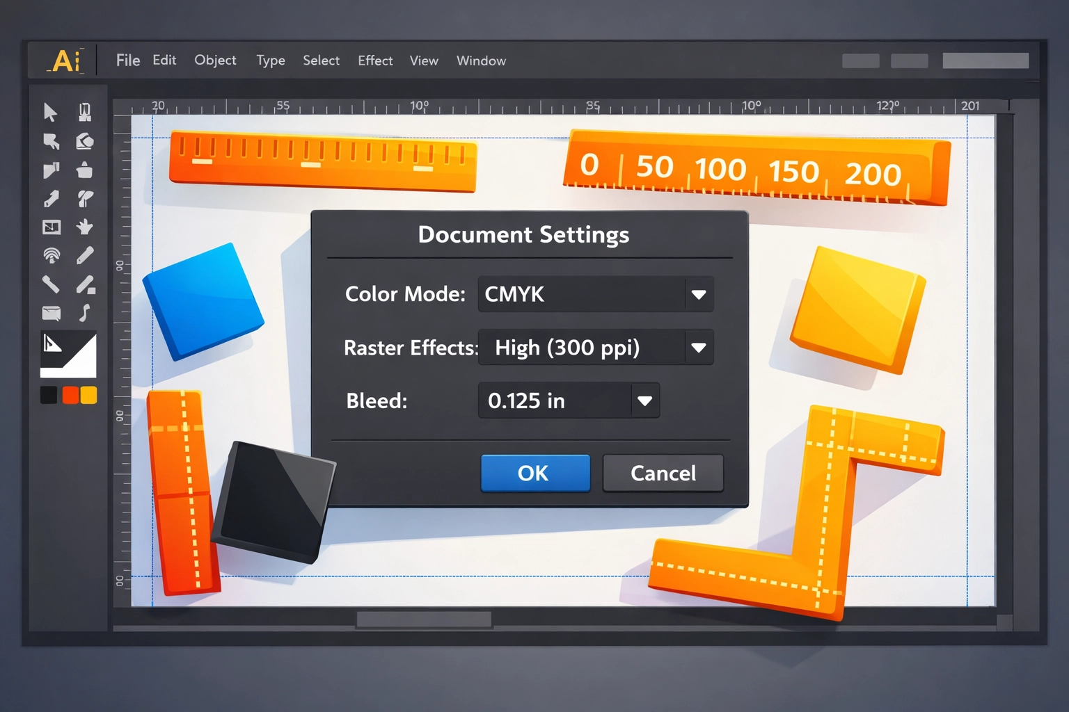
Artboard dimensions should match your final trim size plus bleed. Create multiple artboards within a single document when working on multi-page projects or design variations. This keeps related files organized and simplifies version control.
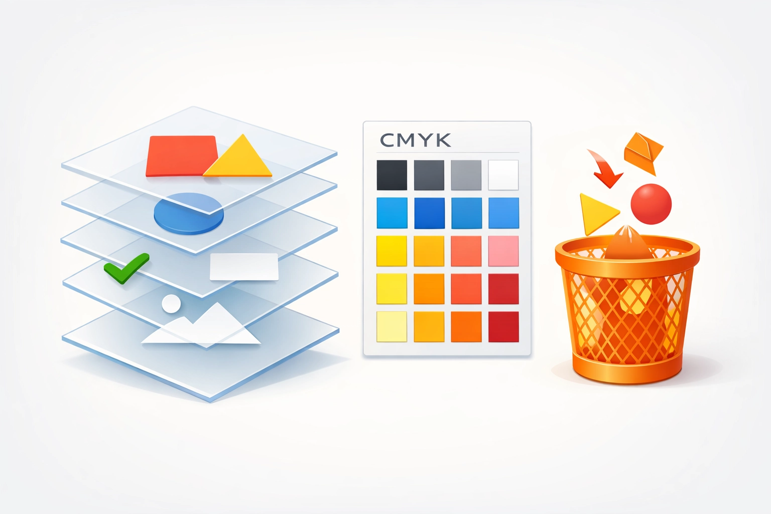
Step 2: Eliminate Unnecessary Elements and Organize Layers
File bloat slows processing and creates confusion during preflight checks. Open your Swatches panel and delete unused color swatches that accumulate during the design process. Select "Select All Unused" from the panel menu, then click the trash icon. This removes swatches not actively applied to objects in your design.
Consolidate layers to improve file structure. Excessive layers with vague names like "Layer 12" or "Copy 3" make troubleshooting difficult when problems arise. Rename layers descriptively based on their content: "Logo," "Background Pattern," "Body Text." Merge layers that don't require separate manipulation. However, maintain separation between critical elements that might need individual adjustments during proofing.
Delete hidden objects and unused assets. Designers often move rejected concepts off the artboard rather than deleting them. These lingering elements increase file size and occasionally cause unexpected issues during RIP processing. Use Object > Path > Clean Up to remove stray points and empty text paths automatically.
Lock background elements to prevent accidental selection and modification. This proves especially valuable in complex files with overlapping objects. Locked layers still print normally but cannot be edited without deliberately unlocking them first.
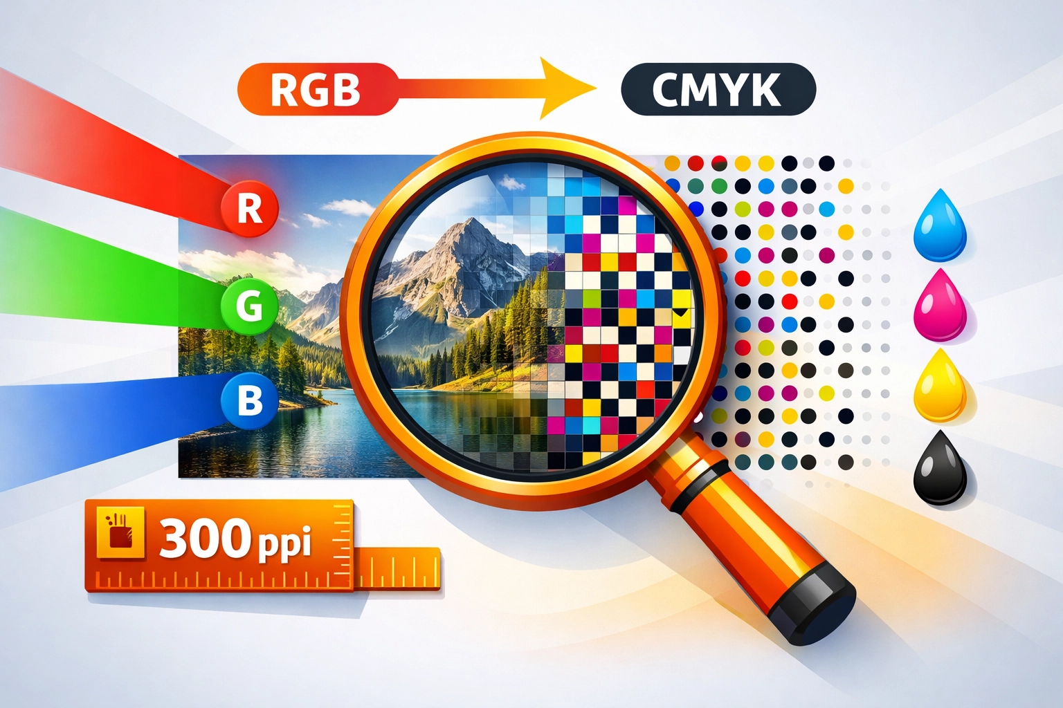
Step 3: Convert Images to CMYK and Verify Resolution
Placed raster images require separate attention from vector artwork. All linked or embedded images must use CMYK color mode for accurate reproduction. RGB images appear vibrant on screen but often print darker and muddier than expected because monitors and printers reproduce color differently.
Check image resolution through the Links panel. Select a linked image and look at the information display. Effective resolution should meet or exceed 300 ppi at the size the image appears in your layout. An image that measures 4 x 6 inches at 300 ppi maintains quality at that size. Scaling it up to 8 x 12 inches drops the effective resolution to 150 ppi, creating visible quality loss in print.
Photoshop handles color conversion more accurately than Illustrator for complex images. Open problem images in Photoshop, convert them to CMYK through Image > Mode > CMYK Color, then replace the linked file in Illustrator. This workflow preserves detail better than in-program conversion.
Embed images when file portability matters. Linked images require sending separate files alongside your Illustrator document. Embedding incorporates image data directly into the .ai file, simplifying file transfer. However, embedding significantly increases file size. For large projects, packaging files through File > Package creates a folder with your document and all linked assets organized together.
Monitor spot colors in placed images. Some workflows require spot color channels for specialty inks like metallic or fluorescent colors. Verify that spot colors in your images match spot colors defined in your Illustrator swatches panel. Mismatched spot color names create additional separations during output, increasing production costs.
Step 4: Convert Text to Outlines
Font substitution creates the most common and frustrating print production delays. When a printer opens your file without access to your specific fonts, Illustrator substitutes default fonts that rarely match your design intent. Headlines shift position, body text reflows unexpectedly, and layout integrity collapses.
Converting text to outlines eliminates font dependency. Select all text objects in your document using Select > Object > Text Objects. Then choose Type > Create Outlines or press Command + Shift + O (Control + Shift + O on Windows). This command converts letterforms from editable text into vector shapes.
Save a copy with live text before outlining. Once converted, text cannot be edited or spell-checked without undoing the operation. Maintain a working file with editable text separate from your final print-ready version. Use clear file naming conventions like "BusinessCard_Working.ai" and "BusinessCard_PrintReady.ai" to avoid confusion.
Consider text editing needs before final conversion. Small text under 8 points sometimes renders more clearly as live text than as outlined shapes, depending on your output device. Discuss these technical details with your print provider for specialty applications.
Outline text in grouped objects and symbols. Simply selecting visible text misses text hidden within groups or symbol instances. Use Select > Object > Text Objects to catch all text regardless of hierarchy or visibility. This comprehensive selection prevents overlooked text from causing production problems.
Step 5: Export Using High-Quality Print PDF Settings
PDF format standardizes file exchange across different systems and software versions. Navigate to File > Save As and select Adobe PDF from the format dropdown. Choose the "High Quality Print" preset as your starting point. This preset balances file size with print quality appropriately for most commercial applications.
Enable "Use Document Bleed Settings" to transfer your established bleed measurements into the PDF. This checkbox appears in the Marks and Bleeds section of the PDF export dialog. Without this setting enabled, your bleed area crops out of the exported file, defeating its purpose.
Deselect "Preserve Illustrator Editing Capabilities" when file size becomes problematic. This option embeds complete Illustrator data within the PDF, allowing full editing if reopened in Illustrator. However, it doubles or triples file size. For final production files that won't require further editing, disabling this option creates more manageable file sizes without affecting print quality.
Review the Output settings section. Confirm your color conversion is set to "No Color Conversion" to prevent unwanted color space changes during export. Your document should already be in CMYK, making additional conversion unnecessary and potentially harmful to color accuracy.
Include printer marks only when specifically requested. Crop marks, registration marks, and color bars help print technicians align and calibrate output. However, many modern workflows handle these elements automatically. Adding unnecessary marks can interfere with automated processing systems.
Save your PDF with a descriptive filename including version numbers or dates. "Logo_v3_020626.pdf" communicates more information than "Final.pdf." This naming discipline prevents confusion when managing multiple revisions and speeds up file retrieval during rush projects.
Verification Before Submission
Run a preflight check after completing all five steps. Illustrator's built-in preflight tool (Window > Separations Preview) shows how your file separates into CMYK plates. Look for unexpected spot colors appearing as additional separations. Each additional plate increases printing costs significantly.
Open your PDF in Adobe Acrobat to verify the final output. Zoom to 300% or 400% to inspect fine details and text rendering. Check that bleeds extend properly beyond trim marks. Confirm all required elements appear correctly positioned.
Contact your print provider before submission if questions arise about specific technical requirements. Printers often maintain detailed specifications for their equipment and workflows. Following their guidelines exactly the first time prevents revision cycles that delay delivery and increase costs.
Works Cited
Adobe Inc. (2024). Adobe Illustrator User Guide. Retrieved from https://helpx.adobe.com/illustrator/user-guide.html
Baxter, T. (2023). Print Production Fundamentals. New York: Graphic Arts Publishing.
International Color Consortium. (2024). ICC Color Management Specifications. Retrieved from https://www.color.org
Print Industries Association. (2023). Best Practices for File Preparation. Pittsburgh: PIA Technical Services.
Romano, F. (2024). Pocket Guide to Digital Prepress. Boston: Delmar Cengage Learning.
Sharma, K. (2023). Understanding bleed and trim in professional printing. Print & Graphics Quarterly, 45(3), 78-82.
Recent Comments