
Let's cut straight to it: if your website doesn't look great on every device in 2026, you're essentially invisible. Harsh? Maybe. True? Absolutely.
We get it, you've probably heard "mobile-friendly" advice for years now. It might feel like old news. But here's the thing: responsive web design has evolved from a nice-to-have feature into the very foundation of your online existence. Miss this, and you're not just losing a few visitors. You're hemorrhaging potential customers, tanking your search rankings, and handing your competitors an easy win.
So let's break down exactly why responsive web design matters more than ever in 2026, and what you can do about it.
What Is Responsive Web Design, Anyway?
Before we dive deeper, let's make sure we're on the same page.
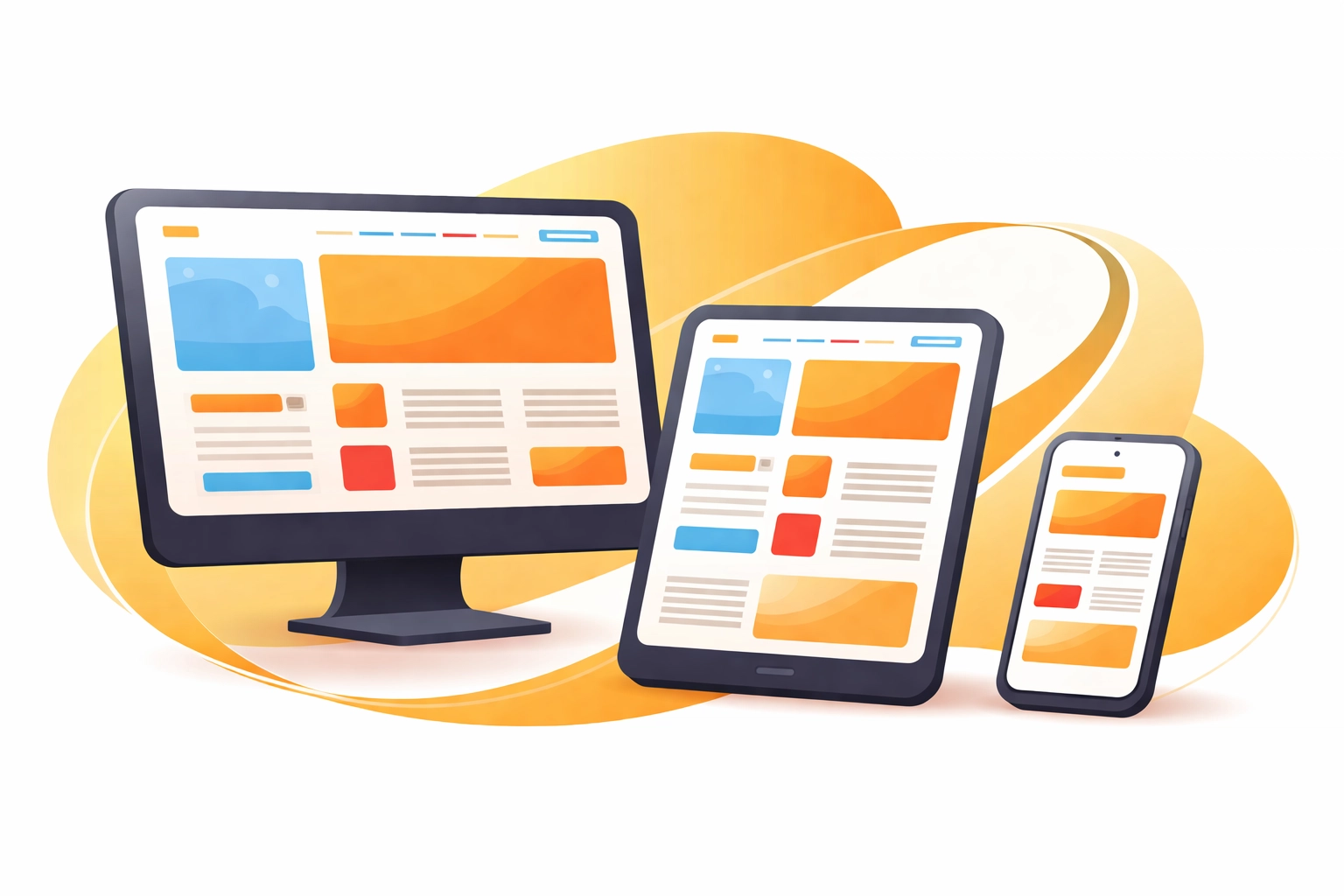
Responsive web design is an approach that ensures your website automatically adjusts its layout, images, and content to fit whatever screen size someone is using. Whether your visitor is browsing on a massive desktop monitor, a tablet while lounging on the couch, or a smartphone during their morning commute, responsive design delivers a seamless experience.
No pinching. No zooming. No frustration.
Instead of building separate websites for mobile and desktop (which is expensive and a nightmare to maintain), responsive design uses flexible grids, layouts, and CSS media queries to create one site that works everywhere.
The Numbers Don't Lie: Mobile Dominates
Here's a stat that should stop you in your tracks: over 62% of all global internet traffic now comes from mobile devices. That's not a trend: it's the new normal.
Think about your own habits for a second. How often do you pull out your phone to check something quickly? To browse social media? To make a purchase? Your customers are doing the exact same thing.
And here's where it gets interesting: users don't stick to just one device anymore. They might discover your business on their phone during lunch, research you on a tablet that evening, and finally make a purchase on their laptop the next morning. In fact, 83% of users expect a smooth experience when switching between devices.
If your website stumbles on any of those screens, you've just lost that customer. Period.
Google Has Spoken: No Mobile, No Rankings
This is the part where things get serious for your business.
Google now uses mobile-first indexing as the primary way it evaluates and ranks websites. What does that mean in plain English? Google looks at the mobile version of your site first when deciding where you show up in search results.
If your site isn't mobile-friendly, Google might not even index it at all. You could have the most beautifully designed desktop website in the world, packed with incredible content: and still be completely invisible in search results.
The data backs this up: 62% of top-ranking websites were designed with mobile-first or mobile-optimized approaches. That's not a coincidence. That's Google literally telling us what works.

The Real Cost of Ignoring Responsive Design
Let's talk about what happens when your website isn't responsive.
Sky-High Bounce Rates
When visitors land on a site that's clunky, hard to navigate, or forces them to zoom in just to read the text, they leave. Fast. Non-responsive websites see bounce rates around 60% or higher. That means more than half of your visitors are gone before they even see what you offer.
Lost Conversions and Revenue
Here's a number that should keep you up at night: mobile-friendly websites achieve 40% higher conversion rates compared to sites that aren't optimized. Whether you're trying to get email signups, phone calls, or actual purchases, a responsive site directly impacts your bottom line.
Frustrated Customers Who Won't Return
First impressions matter online. If someone has a bad experience on your site, they're not coming back. Worse, they might tell others. In an era where reviews and word-of-mouth spread like wildfire, you can't afford to frustrate potential customers with a janky website experience.
Slower Load Times
Responsive design, when done right, contributes to faster page load times. And speed matters: a lot. If your site takes more than three seconds to load, users start leaving in droves. Google also uses page speed as a ranking factor, so slow sites get penalized twice: once by impatient users and once by search algorithms.
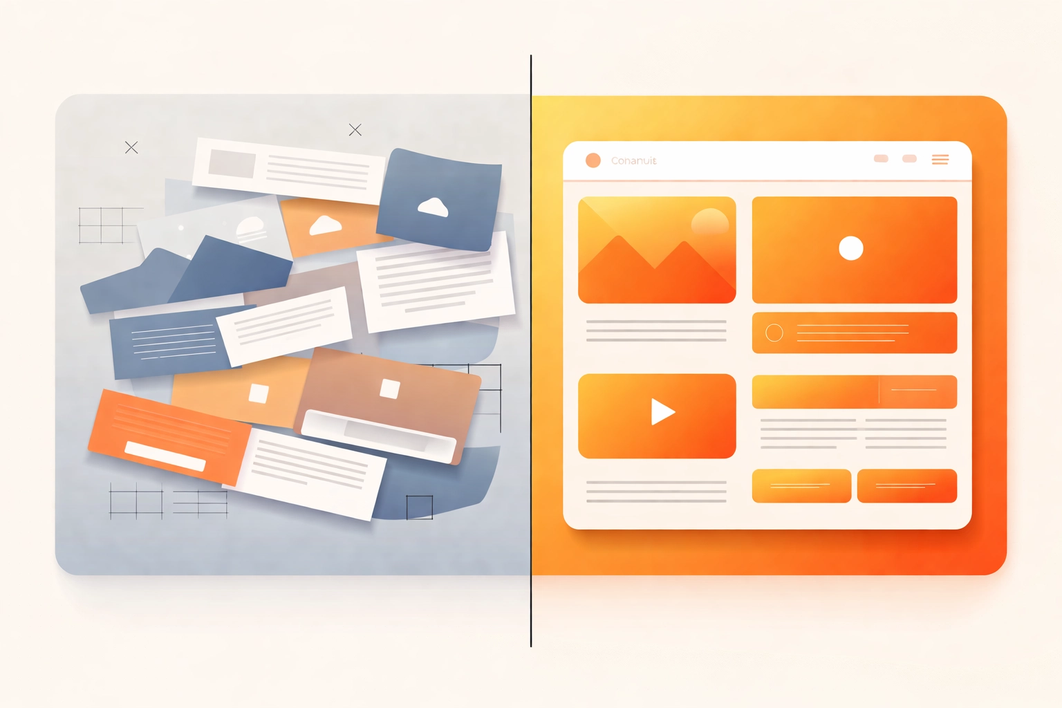
What Does Great Responsive Design Look Like?
So what separates a truly responsive website from one that just kinda-sorta works on mobile?
Fluid Grids and Flexible Layouts
Instead of fixed pixel widths, responsive sites use relative units (like percentages) that allow content to flow and adapt. Columns might stack on mobile, spread out on tablets, and display side-by-side on desktops.
Scalable Images and Media
Images automatically resize to fit the screen without losing quality or slowing down load times. Videos embed responsively. Nothing gets cut off or awkwardly cropped.
Touch-Friendly Navigation
Buttons and links are sized appropriately for fingers, not just mouse cursors. Menus collapse into easy-to-use hamburger icons on smaller screens. Forms are simple to fill out on any device.
Readable Typography
Text scales appropriately so users never have to pinch and zoom. Line lengths adjust for comfortable reading. Headings create clear visual hierarchy regardless of screen size.
Performance Optimization
Responsive design goes hand-in-hand with performance. Images are compressed. Code is clean. The site loads quickly on mobile networks, not just fast Wi-Fi connections.
"My Site Looks Fine on My Phone" : The Dangerous Assumption
Here's a trap many business owners fall into: they pull up their website on their own phone, it looks okay, and they assume everything is fine.
But "looks okay" isn't the same as "performs well." And your personal phone isn't representative of every device your customers use.
True responsive design means testing across multiple devices, screen sizes, and browsers. It means checking load times on slower connections. It means ensuring that every single user: regardless of how they access your site: gets the experience they deserve.
This is exactly why 53.8% of web designers report that "not being responsive on all devices" is the top reason clients come to them for a redesign. Businesses eventually realize that their site isn't cutting it: usually after losing significant traffic and revenue.
Future-Proofing Your Business
Here's the reality: device diversity is only going to increase. We've got foldable phones, tablets of every size, smart displays, and who knows what's coming next. The businesses that thrive are the ones building flexible, responsive websites that can adapt to whatever screen comes along.
Responsive design isn't just about solving today's problems. It's about positioning your business for tomorrow.

What Should You Do Next?
If you're reading this and feeling a little nervous about your current website, that's actually a good thing. Awareness is the first step.
Here's what we recommend:
Test your site on multiple devices right now. Not just your phone: borrow a friend's tablet, check it on different browsers.
Check your analytics. What percentage of your traffic comes from mobile? If your bounce rate on mobile is significantly higher than desktop, that's a red flag.
Run Google's Mobile-Friendly Test. It's free and will give you immediate feedback on issues Google sees.
Consider a professional audit. Sometimes you need fresh eyes to spot problems you've become blind to.
At Creative Design Hub, we build responsive websites that don't just look good: they perform. We understand that your website is often the first impression potential customers have of your business, and we make sure that impression is flawless on every device.
The Bottom Line
Does responsive web design really matter in 2026? It's not even a question anymore.
Responsive design determines whether people find you on Google. It determines whether visitors stay on your site or bounce immediately. It determines whether browsers become buyers.
In 2026, responsive web design isn't an upgrade or an enhancement. It's the price of entry. And businesses that recognize this: and invest accordingly: are the ones that will thrive.
Ready to make sure your website works as hard as you do? Get in touch with us and let's talk about what responsive design can do for your business.
Recent Comments