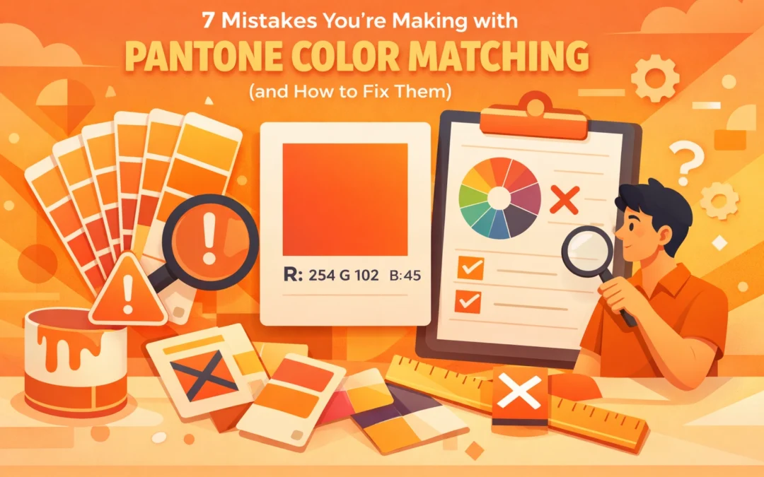
Color accuracy separates amateur work from professional output. When clients specify Pantone 185C for their brand, they expect consistency across every touchpoint. Yet even experienced designers stumble over common pitfalls that compromise color fidelity. These mistakes cost time, waste materials, and damage client relationships.
1. Trusting Software CMYK Conversions
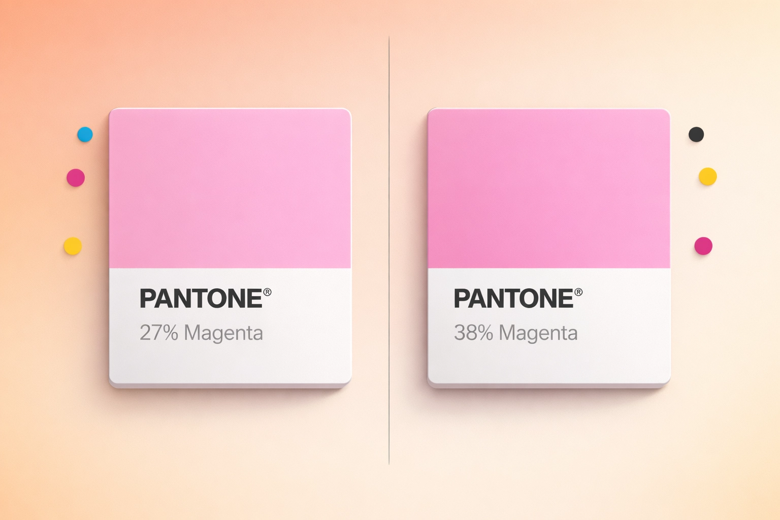
Adobe Illustrator converts Pantone 1767C to C-0/M-27/Y-12/K-0. Photoshop renders the same color as C-0/M-38/Y-9/K-0. The official Pantone Color Bridge lists it as C-0/M-32/Y-10/K-0. Three different sources, three different results.
Software algorithms interpret ICC profiles differently. Each program applies its own color management logic when converting spot colors to process builds. Relying on automatic conversions creates inconsistent output across your workflow.
The Fix: Reference physical Pantone Color Bridge guides for CMYK conversions. These printed swatches show how spot colors translate to process builds under standardized conditions. When preparing files for offset printing, input the exact CMYK values from the Color Bridge rather than accepting software defaults. Document these values in your color specifications to maintain consistency across team members and production runs.
2. Using the Wrong Pantone System for Your Substrate
Pantone Formula Guides come in coated, uncoated, and matte variations. The textile industry uses TCX and TSX systems. Plastics require their own guides. Each system addresses how ink or dye behaves on specific materials.
Specifying Pantone 185C from a coated paper guide for a fabric application guarantees mismatch. The pigment chemistry differs between printing inks and textile dyes. Surface texture and absorption rates vary dramatically across substrates. A color that looks vibrant on glossy coated stock appears muted on uncoated paper or fabric.
The Fix: Match your Pantone reference to your production method. For screen printing on textiles, work from Pantone Fashion, Home + Interiors guides. For offset printing, use Formula Guides appropriate to your paper stock. When projects span multiple substrates, maintain separate specifications for each material type. Brief your printer or manufacturer on which Pantone system applies to your job.
3. Evaluating Colors Under Poor Lighting
That rich navy you approved under fluorescent office lights? It looks purple under daylight and black under warm LED bulbs. Color perception shifts dramatically based on light source, intensity, and color temperature.
Most offices use mixed lighting conditions. Windows provide daylight with one color temperature while overhead fixtures emit another. This inconsistent environment makes accurate color judgment impossible. Your eyes adapt to ambient conditions, skewing your perception without you realizing it.
The Fix: Evaluate color decisions in controlled lighting conditions. Industry standard viewing booths provide D50 or D65 illumination at 5000K or 6500K color temperature. These simulate standardized daylight conditions. Position your Pantone guides and printed samples at a 90-degree angle to the light source to minimize glare. Keep viewing sessions brief since eye fatigue reduces color discrimination ability. For critical color matching work, invest in a color viewing station that meets ISO 3664 standards.

4. Ignoring How Material Finish Affects Color Perception
Print Pantone 185C on gloss-coated stock and matte stock. Hold them side by side. The gloss version appears more saturated and vibrant. The matte sample looks duller and lighter. You used identical ink, but surface finish changes everything.
Light reflection and absorption vary with surface texture. Smooth, glossy surfaces reflect more light, intensifying color perception. Textured or matte finishes scatter light, reducing apparent saturation. Fabric weave, paper tooth, and coating thickness all influence final color appearance.
The Fix: Account for finish in your specifications. When communicating color requirements, note both Pantone reference and substrate finish. Request physical samples on actual production materials before approving final colors. For fabric applications, specify whether swatches show finished or unfinished material. Build extra review time into schedules for finish-dependent color approval. Test prints on final substrates reveal issues that screen previews and guide comparisons miss.
5. Skipping Lab Dips for Multi-Material Projects
Your packaging design spans printed cardstock, injection-molded plastic, and woven labels. You specify Pantone 185C across all components. Production delivers three noticeably different reds.
Each manufacturing process uses different colorants, application methods, and substrates. Printing ink behaves differently than molded plastic pigment or textile dye. Even with identical Pantone targets, visual consistency across materials requires adjustment.
The Fix: Request lab dips or strike-offs for each material in your project. Lab dips are small-batch color samples produced on actual production substrates using final manufacturing methods. Review all samples together under proper lighting. Approve color adjustments that achieve visual consistency rather than insisting on identical formulas. Document approved samples and store them as production standards. Require manufacturers to match approved lab dips rather than just Pantone numbers.

6. Overlooking Color Vision Deficiencies
Approximately 8% of men and 0.5% of women have some form of color vision deficiency. If your team makes color-critical decisions daily, statistics suggest at least one member may perceive colors differently than intended.
Red-green color blindness affects ability to distinguish certain hues. Blue-yellow deficiencies create other problems. Even people with normal color vision vary in color discrimination ability. Relying solely on individual judgment introduces unnecessary risk.
The Fix: Implement objective color measurement tools. Spectrophotometers quantify color values independent of human perception. Devices like X-Rite i1 or Datacolor SpyderX provide numerical data confirming color accuracy. For teams doing consistent color work, consider administering the Farnsworth-Munsell 100 Hue Test. This assessment identifies color vision limitations and helps assign responsibilities accordingly. Establish two-person approval processes for critical color decisions to catch perception-based errors.
7. Neglecting Proper Guide Maintenance
Your Pantone Formula Guide sits on your desk, exposed to sunlight streaming through the window. You've used it for three years. The pages show fingerprints, coffee stains, and dog-eared corners. Those faded, dirty swatches no longer represent accurate color references.
Pantone guides contain printed inks that deteriorate over time. UV exposure fades colors. Humidity and temperature fluctuations cause chemical changes. Oils from fingerprints contaminate surfaces. After 12-18 months of regular use, guides lose accuracy.
The Fix: Store Pantone guides in their protective sleeves away from direct light. Handle pages by edges to minimize oil transfer. Keep guides in climate-controlled environments. Replace Formula Guides annually and Color Bridge books every 18 months with regular use. Date your guides when purchased to track replacement schedules. Consider this an operational expense, not an optional upgrade. Matching colors to inaccurate references wastes more money than guide replacement costs.
Implementing Better Color Workflows
Color accuracy requires systematic processes, not just good intentions. Build checklists covering substrate specification, lighting conditions, and reference materials. Document your color management protocols so team members follow consistent procedures.
Invest in proper tools. Color viewing booths, current Pantone guides, and spectrophotometers pay for themselves through reduced reprints and client satisfaction. Train your team on color fundamentals and your specific workflows.
When projects involve critical color matching, budget extra time for sample approval cycles. Rush jobs skip essential verification steps, leading to expensive mistakes. Build relationships with suppliers who understand color requirements and can provide reliable lab dips and production samples.
Color precision demonstrates professionalism. Clients notice when their brand colors reproduce consistently across applications. Your attention to these technical details separates your work from competitors who treat color as an afterthought.
Works Cited
Fraser, B., Murphy, C., & Bunting, F. (2005). Real World Color Management (2nd ed.). Peachpit Press.
Sharma, A. (2004). Understanding Color Management. Thomson Delmar Learning.
X-Rite Incorporated. (2021). The Color Guide and Glossary: Communication, Measurement, and Control for Digital Imaging and Graphic Arts. X-Rite.
Pantone LLC. (2023). Pantone Color Systems. https://www.pantone.com
International Organization for Standardization. (2009). ISO 3664:2009 Graphic technology and photography( Viewing conditions.) ISO.
Recent Comments