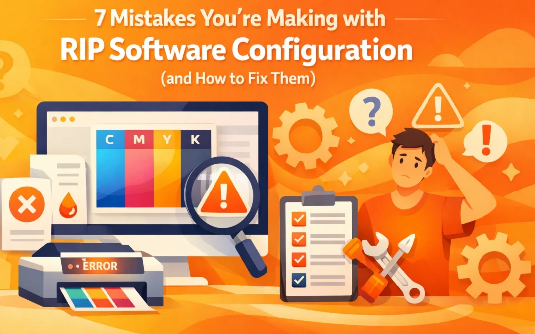
Raster Image Processor (RIP) software serves as the essential bridge between digital design files and physical print output. It translates vector paths and pixel data into the specific dot patterns that a printer hardware understands. For professionals at Creative Design Hub (84G), mastering this software is the difference between a high-quality finished product and a wasted roll of media. Many print operators treat RIP software as a simple "print" button, yet improper configuration leads to color shifts, banding, and excessive ink consumption. Identifying and rectifying these common configuration errors will optimize your production workflow and ensure color consistency across varied substrates.
1. Mismanaging ICC Profiles and Color Spaces
The most frequent error in print production involves a misunderstanding of International Color Consortium (ICC) profiles. Many operators assume that selecting a generic "CMYK" profile is sufficient for any media. However, an ICC profile is specific to the combination of the printer, the ink set, and the substrate. Using a vinyl profile for a canvas print will result in incorrect ink density and shifted hues.
To fix this, you must match your RIP settings to the exact media loaded in the machine. If a specific profile does not exist for your substrate, you must perform a media calibration. This involves printing a series of color targets, reading them with a spectrophotometer, and generating a custom profile. This process ensures that a 50 percent cyan in your Adobe Illustrator file actually results in a 50 percent cyan output on the final product.

2. Incorrect Interpolation and Scaling Algorithms
When a low-resolution file is sent to a large format printer, the RIP software must calculate the missing pixels to fill the physical dimensions. This process is known as interpolation. Many operators leave the RIP on its default setting, which is often "Nearest Neighbor." This method is fast but results in jagged edges and pixelation.
For high-quality graphics, you should configure your RIP to use "Bicubic" or "Lanczos" interpolation methods. These algorithms analyze surrounding pixels to create smoother transitions and sharper edges. While these methods require more processing power and time, they are vital for maintaining professional standards when scaling designs for banners or vehicle wraps. You can find more information on technical file preparation at https://www.84g.net/product-tag/graphic-design.
3. Improper Spot Color Mapping
Spot colors, such as those in the Pantone Matching System (PMS), are often misinterpreted by RIP software if the internal library is not correctly prioritized. If the software is configured to convert all spot colors to process CMYK using the file's embedded values, you lose the ability to use the printer's full gamut to hit that specific color.
The fix involves ensuring your RIP software has its spot color replacement library enabled. This allows the software to recognize the "Pantone 286 C" name in the file and use a pre-calculated ink recipe that is optimized for your specific ink set. Always check the "Spot Color" tab in your RIP queue to verify that the software recognizes the named color rather than treating it as a standard CMYK breakdown.
4. Neglecting White Ink Underbase Settings in DTF and DTG
With the rise of Direct to Film (DTF) and Direct to Garment (DTG) printing, the configuration of the white ink channel has become a critical point of failure. A common mistake is applying a uniform white underbase across the entire design regardless of the image's transparency or color density. This leads to heavy, "bulletproof" prints that lack breathability and crack easily.
You must configure the RIP to generate a "choke" on the white plate. This involves pulling the white ink in by one or two pixels from the edge of the color image to prevent a white halo from appearing. Additionally, using "Gradient White" settings allows the RIP to lay down less white ink under darker colors, which saves money and improves the feel of the garment.

5. Inefficient Nesting and Tiling Configurations
In a high-volume shop, material waste is a direct hit to profitability. Many operators manually place files on a layout, or worse, print files one by one. This leaves large gaps of unprinted media. Furthermore, when printing large murals that require multiple panels (tiling), failing to configure "Overlap" and "Bleed" settings makes installation nearly impossible.
Enable "Auto-Nesting" in your RIP preferences. This feature allows the software to rotate and arrange multiple jobs to utilize the maximum width of the media. For tiled jobs, configure a minimum of a half-inch overlap. This provides the installer with enough room to double-cut the panels on-site, ensuring a seamless transition across the entire wall.
6. Overlooking Dithering and Halftone Patterns
Dithering is the method the RIP uses to arrange dots of ink to simulate continuous tones. Using the wrong dithering pattern can cause "moire" patterns or visible graininess in highlight areas. Many default configurations use a "Stochastic" or "Frequency Modulated" screen, which is generally good for photos but may struggle with solid vector gradients.
If you notice banding in your gradients, experiment with different dithering methods within your RIP, such as "Error Diffusion." This method places dots more randomly, which hides the mechanical patterns of the print head and produces smoother transitions in skin tones and sky gradients. Consistent monitoring of these patterns is essential for maintaining the high-quality standards expected at https://www.84g.net.

7. Failing to Adjust Media Handling and Vacuum Settings
RIP software does more than manage color; it also controls the physical behavior of the printer. A frequent mistake is ignoring the "Vacuum" and "Heat" settings within the media profile. If the vacuum pressure is too high, it can cause the print head to strike the media. If the heater is too low, the ink will not dry fast enough, leading to "bleeding" or "tracking" as the media rolls up.
Each media type requires a specific tension and temperature. High-speed production often requires higher "Inter-print" and "Post-heat" settings to flash-dry the ink. Always perform a physical test of the media transport before starting a long print run. Adjust the "Step" or "Feed" calibration to ensure that the media moves the exact distance required per pass, which eliminates horizontal banding.
Conclusion
Configuring RIP software is not a one-time task but an ongoing part of a professional print workflow. By addressing these seven common mistakes, you can reduce waste, improve color accuracy, and increase the longevity of your hardware. Whether you are working with DTF, wide format vinyl, or sublimation, the technical details in your software configuration dictate the quality of your output. Fine-tuning your interpolation algorithms, mastering spot color libraries, and optimizing your nesting strategies will elevate your production capabilities and provide more reliable results for your clients.
Works Cited
Adobe Systems. (2023). Color Management and ICC Profiles in Print Production. Adobe Creative Cloud Technical Documentation.
Onyx Graphics, Inc. (2024). Optimizing Workflow: Nesting and Tiling Strategies for Large Format Printing. Onyx TV Knowledge Base.
Printing United Alliance. (2025). Digital Color Professional: A Guide to RIP Configuration and Media Profiling. PRINTING United Education Series.
Wasatch Computer Technology. (2023). Understanding Dithering and Halftone Methods in Raster Image Processing. Wasatch SoftRIP Technical White Papers.
X-Rite Pantone. (2024). The Importance of Spectrophotometry in Custom Media Profiling. X-Rite Color Science Publications.
Recent Comments