Achieving perfect color consistency is the hallmark of professional print production. When a brand identifies with a specific shade, such as a signature blue or a vibrant orange, that color must remain identical across business cards, apparel, and large format signage. The Pantone Matching System (PMS) serves as the universal language for this precision. However, many designers and print operators encounter frustrating discrepancies between their digital files and the final physical product. These errors often stem from technical oversights in the workflow or a misunderstanding of how ink interacts with different substrates. By identifying these common pitfalls, shops can reduce waste and improve client satisfaction.
1. Evaluating Color Under Suboptimal Lighting
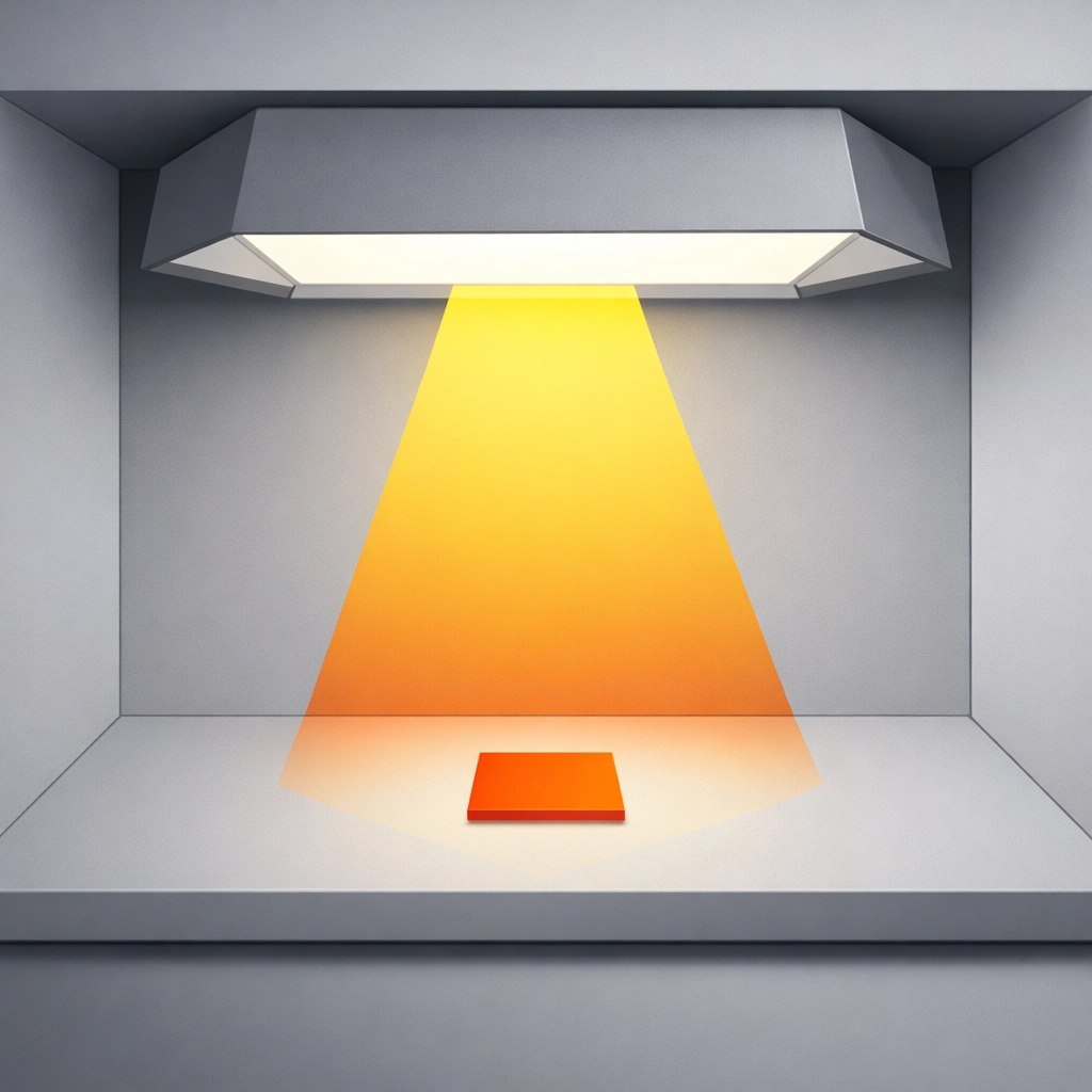
The environment where you approve a color is just as critical as the ink itself. Evaluating a Pantone swatch under standard office fluorescent lights or warm residential LEDs is a fundamental error. These light sources do not provide a full color spectrum, which leads to a phenomenon known as metamerism. This occurs when two colors appear to match under one light source but look drastically different under another.
To fix this, you must perform all color evaluations in a controlled environment using D50 standard lighting. D50 represents a daylight color temperature of 5000 Kelvin, which is the industry standard for graphic arts and printing. Many professional Pantone books include a lighting indicator page at the back. This tool features two patches that react differently to light. If the patches look identical, your lighting is correct. If they appear different, your environment is unsuitable for color matching. Investing in a dedicated viewing booth or D50 compliant bulbs for your prepress area is a necessary step for graphic design accuracy.
2. Using Low-Precision Scales for Ink Mixing
Precision is the difference between a successful print run and a costly mistake. When mixing ink for small batches, such as a single gallon or a specific test plot, the margin for error is incredibly slim. Many shops make the mistake of using standard kitchen scales or industrial scales that only measure to the nearest gram. If a formula calls for 0.05 grams of a concentrated pigment, a scale that rounds to the nearest whole number will lead to an incorrect hue.
The solution requires high-precision digital scales. For any batch under 300 grams, you should use a scale that provides readings to at least 0.01 decimals. For pastel shades or light grays, where even a tiny drop of black or red can overpower the base, hundredth-decimal precision is mandatory. For larger production runs exceeding 500 grams, a scale reading to 0.1 decimal is generally acceptable. Standardizing your measurements in grams rather than ounces also reduces the risk of conversion errors during the mixing process.
3. Ignoring Substrate Color Shift and Dye Migration
A common misconception is that a Pantone ink will look the same regardless of what it is printed on. In reality, the substrate acts as a base filter for the ink. Printing a PMS color on a white coated paper will yield a different result than printing the same ink on a textured yellow garment or a dark polyester fabric. In garment production, especially with DTG (Direct to Garment) or screen printing, the "show-through" of the fabric color can shift the final appearance.
To counteract this, always account for the substrate during the pre-production phase. When printing on dark or colored textiles, a high-opacity white base layer is essential to provide a neutral ground for the Pantone ink. Furthermore, be aware of dye migration in polyester fabrics, where the fabric dye "bleeds" into the printed ink during the curing process. Testing your mixed PMS color on the actual production material is the only way to ensure the final output matches the client's expectations.
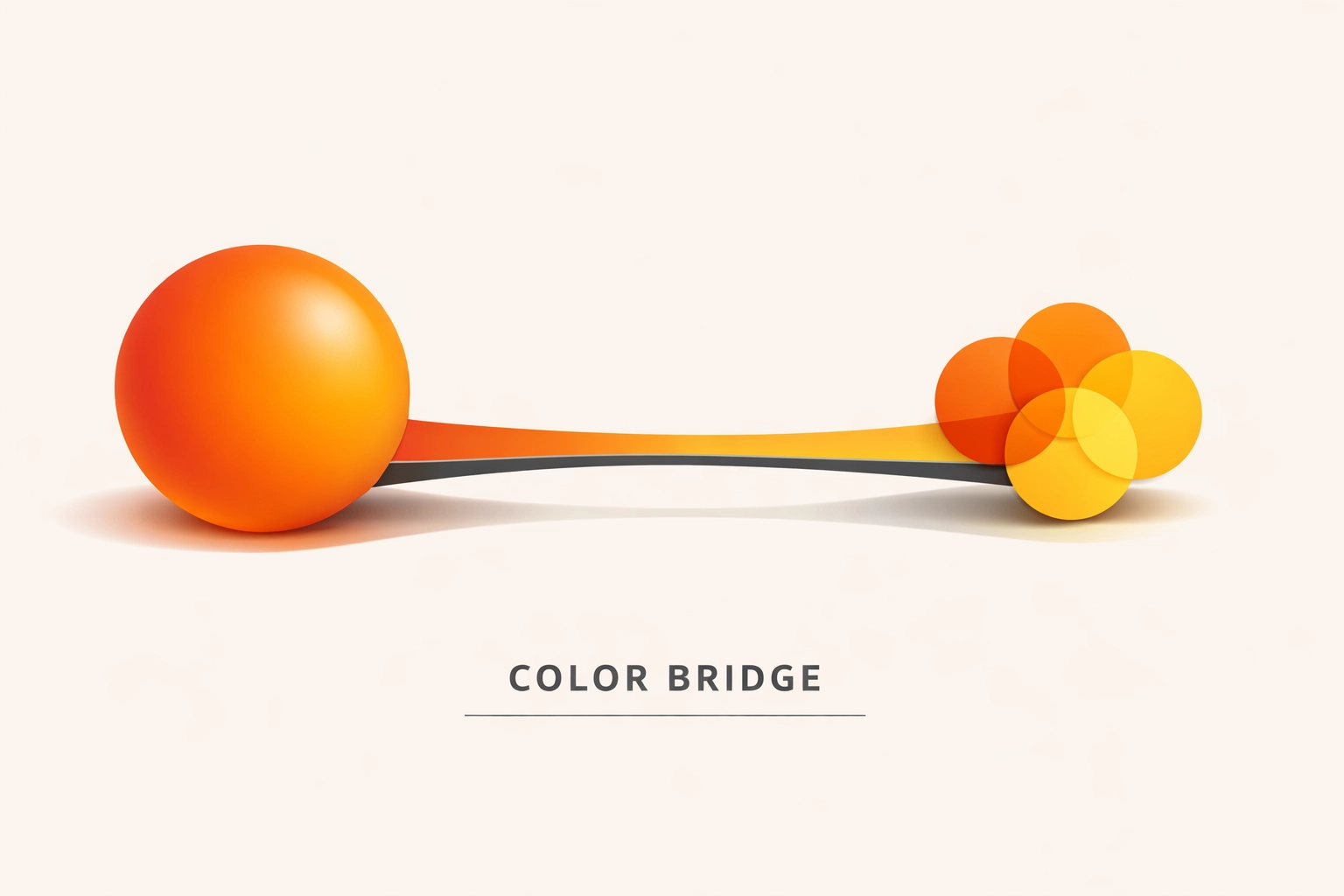
4. Selecting Pantone Colors Without Checking CMYK Compatibility
Not every Pantone color can be reproduced using a standard four-color process (CMYK). Designers often select vibrant neons or deep, saturated blues from the Pantone Formula Guide only to find that their digital press or offset printer cannot reach that specific gamut. This results in "muddy" or dull versions of the intended color, such as a bright Reflex Blue turning into a muted violet.
The fix involves using the Pantone Color Bridge Guide during the design phase. This guide shows the solid Pantone color side-by-side with its closest CMYK equivalent. If the Bridge Guide shows a significant visual difference between the two, you should advise the client to select a different color that bridges more effectively. This proactive approach prevents disappointment during the print production stage when the equipment reaches its physical gamut limits.
5. Over-Reliance on Software Color Conversions
Software like Adobe Illustrator, Photoshop, and various RIP (Raster Image Processor) programs are powerful tools, but they are not infallible. Different versions of Adobe Creative Cloud have changed how they handle Pantone libraries. In recent years, many native Pantone libraries were removed from Adobe software, requiring the use of the Pantone Connect plug-in. Relying on the "default" conversion values provided by software can be dangerous because these values might be based on outdated color profiles or different rendering intents.
Instead of trusting the screen, always verify the CMYK or Lab values against a physical Pantone book. Your RIP software, such as EFI Fiery, Wasatch, or Onyx, should be calibrated with custom ICC profiles for your specific printer and media combination. By mapping the spot color directly in the RIP rather than letting the design software handle the conversion, you gain much tighter control over the output.
6. Skipping the Physical Proofing and Curing Test
Digital proofs are convenient for layout approval, but they are useless for color matching. A monitor uses emitted light (RGB), while print uses reflected light (CMYK or Spot). Even a calibrated monitor cannot perfectly simulate the way ink sits on a substrate. Furthermore, many inks undergo a "dry back" or color shift during the heat curing process. An ink that looks perfect when wet might darken or lose saturation once it passes through a dryer or heat press.
The only reliable fix is to produce a physical strike-off. Print a small sample, cure it completely using your standard production settings, and then compare it to the physical Pantone chip under D50 lighting. This step is particularly vital for DTF (Direct to Film) and Sublimation workflows, where the heat transfer process significantly alters the final pigment appearance. Identifying a five-percent shift at this stage allows you to adjust your formula before committing to a full production run.

7. Failing to Establish Tolerance with Clients
One of the biggest mistakes in professional color matching is the failure to communicate regarding "acceptable" variance. In the world of physics, an exact 100 percent match is nearly impossible across different materials and processes. Factors such as humidity, mechanical wear, and different ink batches can cause minor fluctuations. If a client expects perfection but the substrate only allows for a "close match," a dispute is inevitable.
You should implement the use of Delta E (∆E) measurements if you have a spectrophotometer. Delta E is a metric that quantifies the difference between two colors. A ∆E of less than 1.0 is generally imperceptible to the human eye, while a ∆E of 2.0 to 3.0 is considered acceptable for most commercial work. Discussing these tolerances upfront and showing the client a "closest possible" sample on difficult substrates will protect your reputation and your bottom line. You can find more information about our technical standards at 84G.
Conclusion
Mastering Pantone color matching requires a transition from a "click and print" mindset to a technical, process-driven workflow. By controlled lighting, using precision equipment, and understanding the physical limitations of ink and substrates, you can eliminate the guesswork that leads to wasted materials. Color consistency is not an accident; it is the result of rigorous testing and adherence to industry standards. Implementing these seven fixes will elevate your output from "close enough" to professional grade.
Works Cited
- Pantone LLC. (2023). Color Bridge Guide Coated & Uncoated. Pantone Publishing.
- X-Rite. (2022). The Science of Color: Understanding D50 and D65 Lighting Standards in Print. X-Rite Color Management.
- International Organization for Standardization. (2013). ISO 3664:2009 Graphic technology and photography : Viewing conditions.
- Adobe Systems. (2024). Specifying Spot Colors in Illustrator and Photoshop. Adobe Help Center.
- Printing United Alliance. (2023). Managing Substrate Influence in Digital Textile Printing. Journal of Graphic Communications.
Recent Comments