Your logo is often the first thing people see when they encounter your brand. It's on your website, your business cards, your social media profiles, and maybe even a billboard one day. But here's the thing: a logo isn't just a pretty picture. It's the visual foundation of your entire brand identity.
Whether you're launching a startup, rebranding an existing business, or just curious about how the design process works, this guide will walk you through everything you need to know about creating a logo that works everywhere your brand goes.
Why Your Logo Matters More Than You Think
Think about the brands you interact with daily. Nike's swoosh. Apple's apple. McDonald's golden arches. You recognize them instantly, right? That's the power of effective logo design.
A well-designed logo does three critical things for your business:
- Creates instant recognition – People should be able to identify your brand in a split second
- Builds trust and credibility – A professional logo signals that you take your business seriously
- Communicates your brand personality – Your logo tells people what to expect from you before they even read a word
The problem is, most business owners underestimate how much thought goes into creating a logo that actually accomplishes all three. Let's fix that.
The Three Core Principles of Effective Logo Design
Before we get into the nitty-gritty of colors and fonts, you need to understand the foundational principles that separate forgettable logos from iconic ones.
Simplicity
The best logos are deceptively simple. They look easy to create, but that simplicity is intentional and requires real skill to achieve. Simple logos are easier to recognize, more memorable, and far more versatile across different applications.
Think about it: if your logo has seventeen different elements, it's going to turn into a blurry mess when it's shrunk down to a favicon or embroidered on a polo shirt.
Clarity
Your logo needs to communicate your brand at a glance. That means clean lines, readable fonts, and visuals that don't require explanation. If someone has to squint or ask "what is that supposed to be?": you've already lost them.
Adaptability
This is where many DIY logos fail. Your logo needs to work everywhere: on a massive trade show banner, on a tiny social media profile picture, in full color, and in black and white. If it only looks good in one context, it's not doing its job.
Understanding the Different Types of Logos
Not all logos are created equal, and different styles serve different purposes. Here are the main categories you'll encounter:
Wordmarks – These are text-only logos that rely entirely on typography. Think Google, Coca-Cola, or FedEx. They work best when your company name is distinctive and memorable on its own.
Abstract/Symbol Logos – These use shapes or symbols to represent your brand without explicitly spelling out your name. Nike's swoosh and Pepsi's globe are classic examples.
Combination Marks – These pair text with a symbol or icon. Airbnb and Dropbox use this approach. It's a versatile choice because you can use the full logo or just the symbol depending on the context.
Emblems – These are contained within a specific shape, like a badge or seal. Starbucks and BMW use emblem-style logos. They convey tradition and authority but can be trickier to scale down.
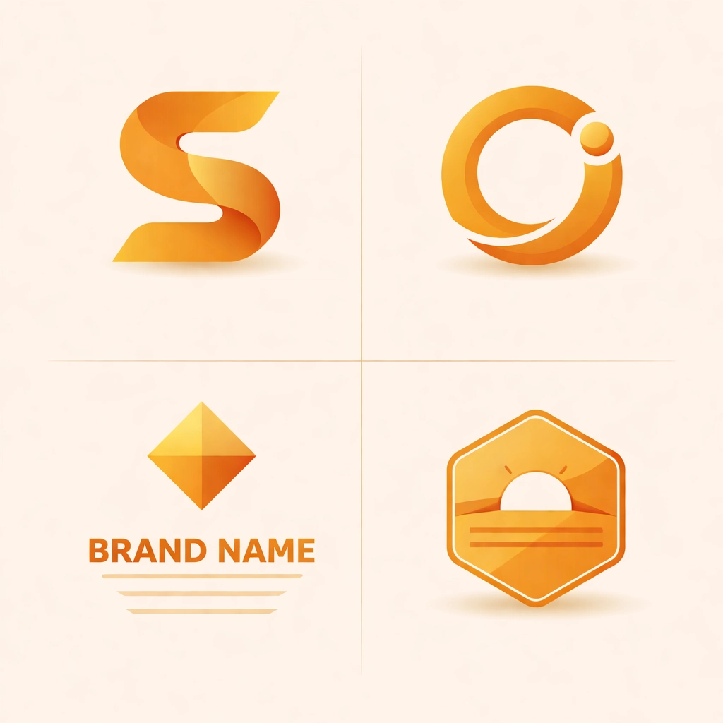
For most small businesses, combination marks offer the best flexibility. You get the name recognition of a wordmark plus a visual element that can stand on its own as your brand grows.
Choosing Your Colors (It's More Strategic Than You Think)
Color isn't just about what looks pretty: it's one of the most powerful tools in your design arsenal. Different colors trigger different psychological responses, and smart brands use this to their advantage.
Here's a quick breakdown:
- Blue – Trust, professionalism, stability (think banks, tech companies)
- Red – Energy, urgency, passion (restaurants, entertainment)
- Green – Growth, health, sustainability (wellness brands, eco-friendly companies)
- Yellow – Optimism, creativity, warmth (youth-focused brands)
- Black – Sophistication, luxury, authority (high-end products)
- Purple – Creativity, wisdom, premium quality (beauty brands)
The key is choosing colors that align with your brand personality and resonate with your target audience. And here's a pro tip: always test your logo in black and white first. If the core design doesn't work without color, it's not strong enough.
Typography: The Unsung Hero of Logo Design
Fonts communicate just as much as colors do. The typeface you choose sets the tone for your entire brand.
Serif fonts (like Times New Roman) feel traditional, established, and trustworthy. Law firms and financial institutions often gravitate toward serifs.
Sans serif fonts (like Helvetica) feel modern, clean, and approachable. Tech startups and contemporary brands love them.
Script fonts add elegance and creativity but can sacrifice readability if overused.
Slab serifs project power and authority: they're bold and attention-grabbing.
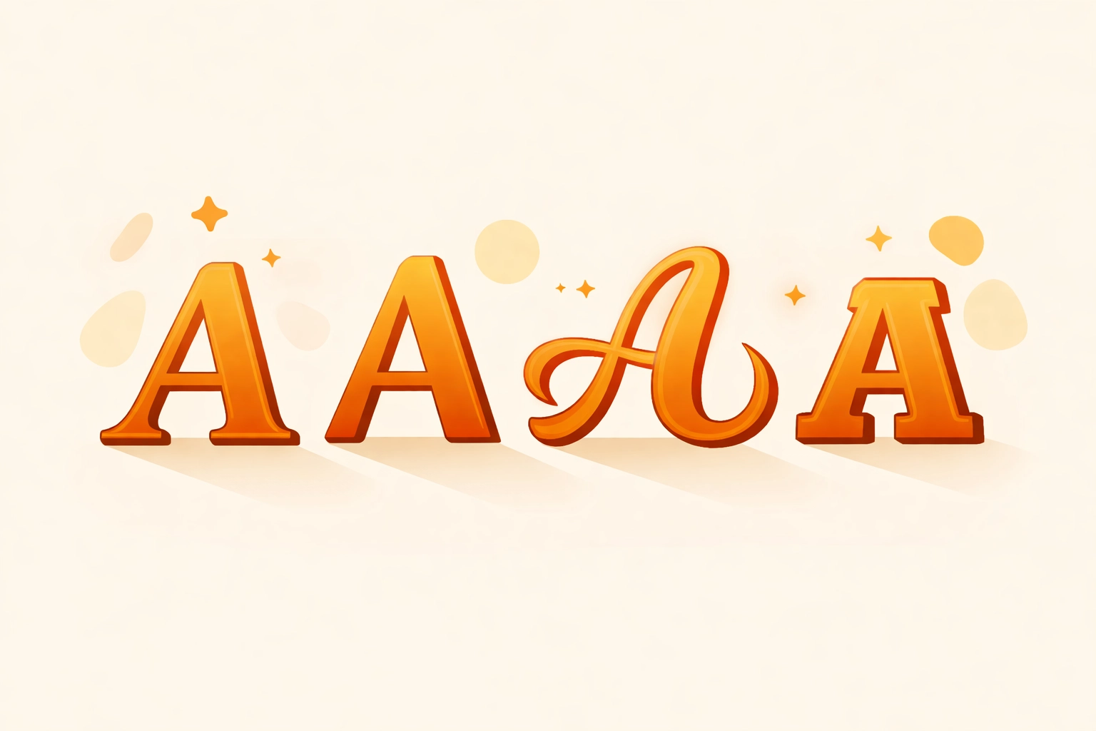
Whatever you choose, readability is non-negotiable. If people can't read your company name, your logo isn't doing its job.
The Five-Step Logo Design Process
Ready to actually create something? Here's a proven framework that professional designers follow:
Step 1: Brainstorm and Research
Start by defining your brand. What are your core values? Who is your target audience? What makes you different from competitors? Write everything down, sketch rough ideas, and gather inspiration. No idea is too basic at this stage.
Step 2: Choose Your Logo Type
Based on your brand personality and goals, decide which logo style makes the most sense. Remember, there's no universally "right" answer: it depends on your specific situation.
Step 3: Select Colors and Typography
Use the principles we covered above to make strategic choices. Limit yourself to two or three colors max, and stick with one or two complementary fonts.
Step 4: Create Initial Designs
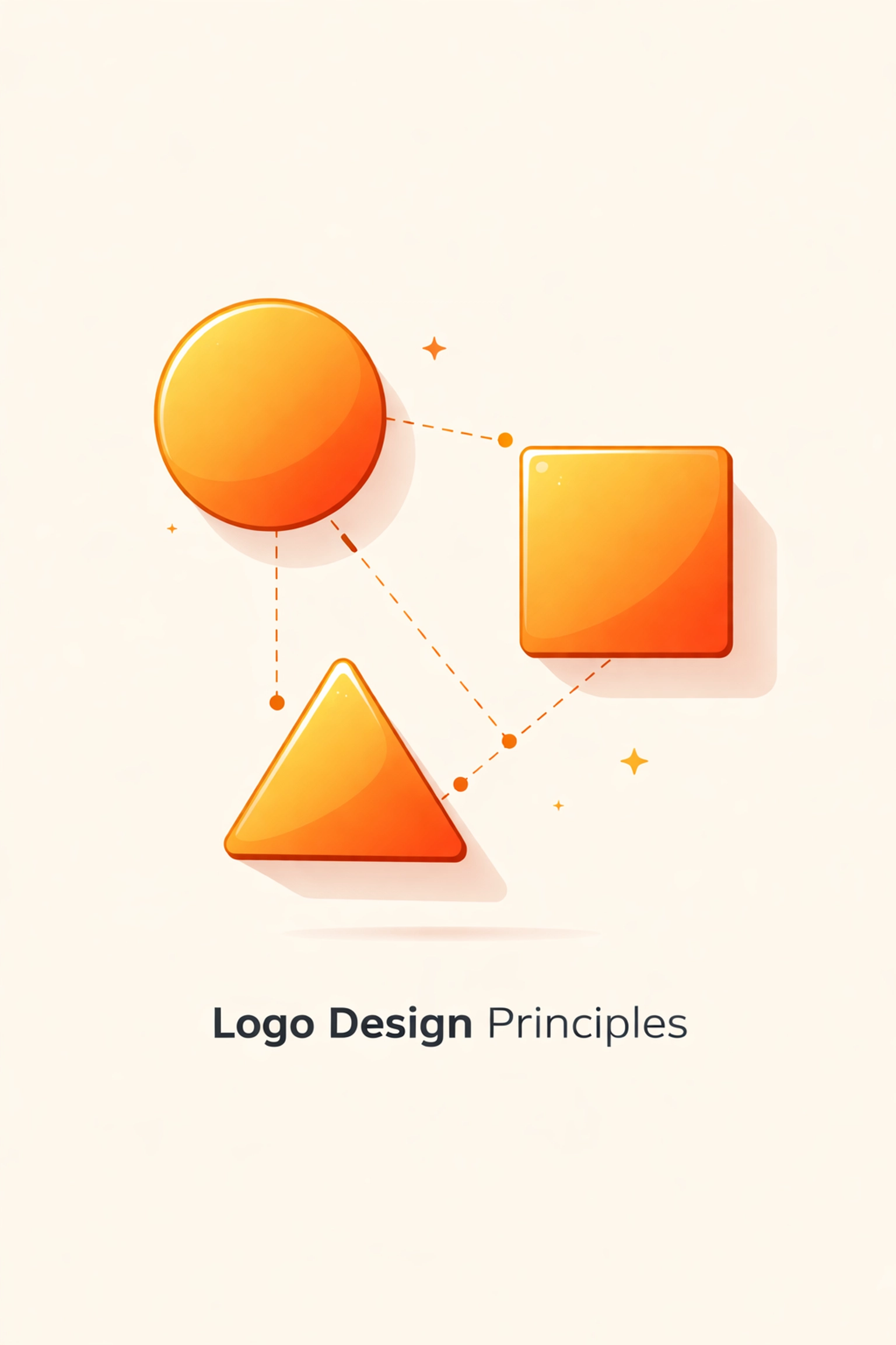
Transform your concepts into actual visual mockups. Focus on using shapes purposefully: circles suggest unity and community, squares convey reliability, and organic curves represent movement and creativity.
Pay attention to white space (the empty areas around your design elements). Good use of white space prevents clutter and creates visual balance.
Step 5: Test and Refine
Here's where many people cut corners: don't. Test your logo at different sizes. Put it on a mock business card, a website header, and a social media profile. Does it hold up? Does it remain clear and recognizable?
Get feedback from people in your target audience, not just your friends and family. Then refine based on what you learn.
Making Your Logo Work Everywhere
A truly effective logo needs to function across every possible application:
- Digital platforms – Website, social media, email signatures, digital ads
- Print materials – Business cards, brochures, packaging, signage
- Merchandise – T-shirts, promotional items, uniforms
- Large format – Banners, billboards, vehicle wraps

To ensure this versatility, create multiple versions of your logo: a full-color version, a one-color version, a reversed (white) version for dark backgrounds, and a simplified icon version for small applications.
Document all of this in a brand style guide that includes usage rules, color codes, and spacing requirements. This keeps your logo consistent as your business grows and more people start using it.
Finally, before you launch, check for trademark conflicts. You don't want to invest in building brand recognition only to discover someone else owns similar intellectual property.
Ready to Build a Brand That Stands Out?
Creating a logo that truly works everywhere takes more than just picking a nice font and calling it a day. It requires strategic thinking, design expertise, and an understanding of how your brand will be perceived across different contexts.
If you're feeling overwhelmed, you're not alone. Most business owners aren't trained designers: and that's okay. What matters is recognizing the importance of getting it right.
Need help bringing your brand vision to life? Check out our logo design services at Creative Design Hub. We specialize in creating professional, versatile logos that help businesses make unforgettable first impressions.
Recent Comments